import numpy as np
import pandas as pd

import matplotlib.pyplot as plt
import plotly.express as px
from plotly.subplots import make_subplots
import plotly.io as pio
pio.renderers.defaule = 'colab'

from itables import show

# This stops a few warning messages from showing
pd.options.mode.chained_assignment = None
import warnings
warnings.simplefilter(action='ignore', category=FutureWarning)Introduction to Data Science
Data Ethics - Misrepresentation and Data Privacy
Important Information
- Email: joanna_bieri@redlands.edu
- Office Hours: Duke 209 Click Here for Joanna’s Schedule
Day 13 Assignment - same drill.
- Make sure Pull any new content from the class repo - then Copy it over into your working diretory.
- Open the file Day##-HW.ipynb and start doing the problems.
- You can do these problems as you follow along with the lecture notes and video.
- Get as far as you can before class.
- Submit what you have so far Commit and Push to Git.
- Take the daily check in quiz on Canvas.
- Come to class with lots of questions!
Data Science Ethics
Today we will start our week long focus on Data Ethics. Although we only have a week of focus on ethics, we have touched on some of these topics before and will keep them in mind going forward!
The content for this class comes from Data Science in a Box Unit 3 Decks 1 and 2. I have updated it for our class, added some of our own examples, and translated the code into Python.
Misrepresentation
Misrepresentation can happen intentionally or unintentionally. It can arise because of lack of knowledge of competence in data science. It is important to be aware of misrepresentation and be able to spot it a mile away in your work and in other peoples work!
————————
Causality
It is important to know when we can see causality in our data. Often our human brains are looking for connections between things:
“If I do X then Y will happen”
Many studies do not actually show causality. How to we communicate our results carefully!
Example Study - Time Magazine
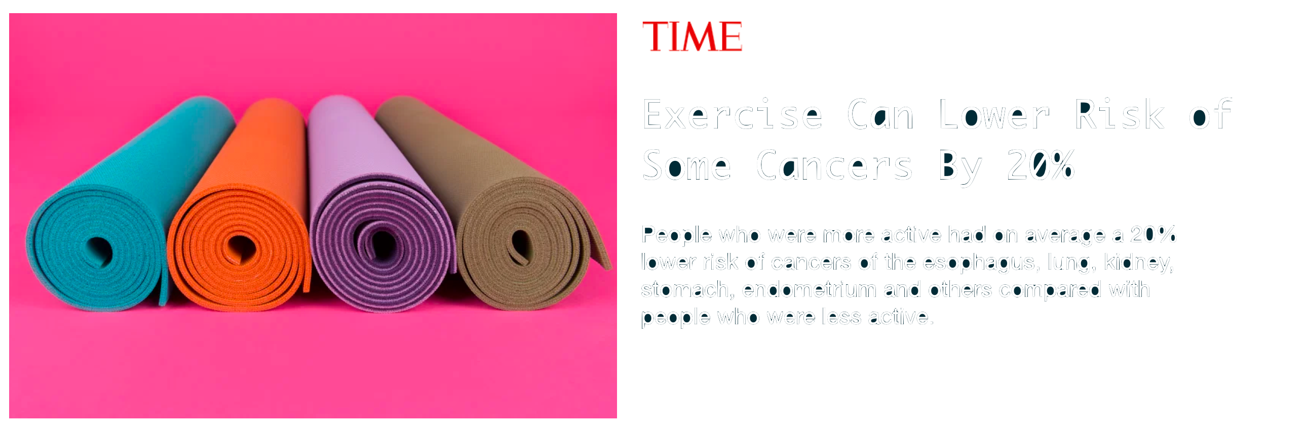
“People who were more active had on average a 20% lower risk of cancers of the esophagus, lung, kidney, stomach, endometrium and others compared with people who were less active”
Alice Park. Exercise Can Lower Risk of Some Cancers By 20%. Time Magazine. 16 May 2016.
- Are there confounding variables?
- This was not a randomized study.
- Can they claim exercise causes this reduction in cancer?
Example Study - Los Angeles Times
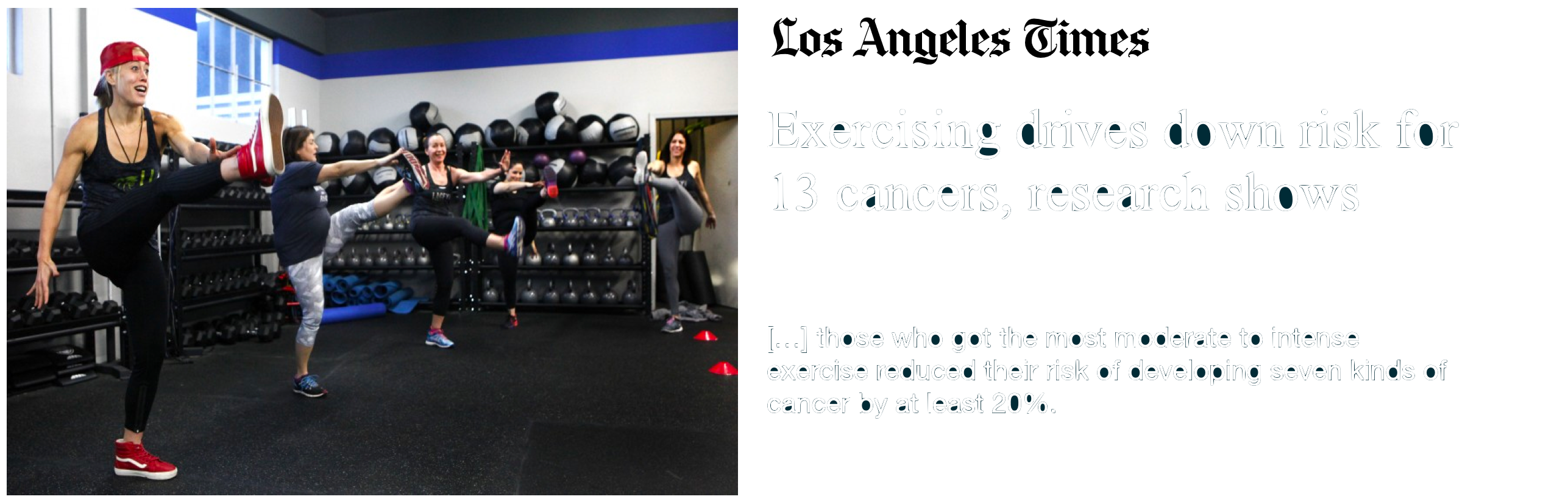
Melissa Healy. Exercising drives down risk for 13 cancers, research shows.
Los Angeles Times. 16 May 2016.
[…] those who got the most moderate to intense exercise reduced their risk of developing seven kinds of cancer by at least 20%
- This is a VERY causal statement!
- This makes it sound like if I started exercising today my risk for cancer would go down - Risk was reduced?
Original study
Moore, Steven C., et al. “Association of leisure-time physical activity with risk of 26 types of cancer in 1.44 million adults.” JAMA internal medicine 176.6 (2016): 816-825.
- There were a HUGE number of volunteers!
- Volunteers were asked about their physical activity level over the preceding year. (Survey!)
- Half exercised less than about 150 minutes per week, half exercised more.
- Compared to the bottom 10% of exercisers, the top 10% had lower rates of esophageal, liver, lung, endometrial, colon, and breast cancer.
- Researchers found no association between exercising and 13 other cancers (e.g. pancreatic, ovarian, and brain).
So what can we actually say?
Exercise was associated with lower cancer rates.
What is the harm here?
Would it be bad if we got people to exercise more? We want to make sure we are not overreaching giving people false hope or knowledge. Just because we can’t make a causal inference doesn’t mean the study is bad - but we want to be clear what the data says.
Carl Bergstrom and Jevin West. Calling Bullshit: The art of skepticism in a data-driven world.
Random House, 2020.
Sharon Begley. “Does exercise prevent cancer?”. StatNews. 16 May 2016.
————————
Data Visualization
There are many ways that visualizations can be (and have been) created to be misleading. You want to make sure that you are communicating your point HONESTLY!
Axes and scale - ex 1
What is the difference between these two pictures? Which presents a better way to represent these data?
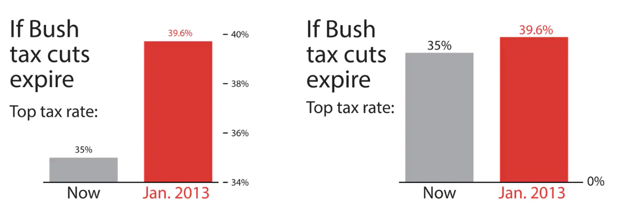
Christopher Ingraham. “You’ve been reading charts wrong. Here’s how a pro does it.”.
The Washington Post. 14 October 2019.
- The numbers at the top of the bars are the same and represent the top tax rate.
- Notice that the minimum for the y-axis is different!
- These tell a very different visual story.
You can really change how people perceive information just buy changing your axis. But should you? It is important that you are not trying to deliberately trying to fool your audience.
You axis should usually start at zero, unless there is a good, honest, data visualization reason that you are not starting a zero.
Axes and scale - ex 2
What is wrong with this picture? How would you correct it?
Fox News is somewhat notorious for misleading graphics and bad data displays. Here is one example:
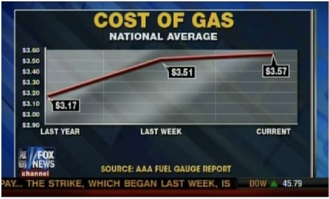
What do you see here? What is not quite right?
- Notice that the x-axis is evenly spaced even though it represents very different time steps!
- This makes it look like gas prices are increasing only a little bit in the last week.
How could we fix this?
- Read the data off of the plot.
- Put it into a data frame.
- Make a plot of our own.
date = ["2019-11-01", "2020-10-25", "2020-11-01"]
cost = [3.17, 3.51, 3.57]
text = ['Last year','Last week','Current']

DF = pd.DataFrame()
DF['date'] = date
DF['cost']=cost
DF| date | cost | |
|---|---|---|
| 0 | 2019-11-01 | 3.17 |
| 1 | 2020-10-25 | 3.51 |
| 2 | 2020-11-01 | 3.57 |
fig = px.line(DF,x='date',y='cost')


fig.update_layout(title='Cost of Gas - National Average',
                  title_x=0.5,
                  xaxis_title="Date",
                  xaxis_range=["2019-10-01", "2020-12-01"],
                  yaxis_title="Price",
                  autosize=False,
                  width=800,
                  height=500)

fig.add_vline(x="2019-11-01")
fig.add_vline(x="2020-10-25")
fig.add_vline(x="2020-11-01")


fig.show()
The picture here is a lot different! The increase between last week a current is much steeper that it appeared in the other graph.
Your axis should always be consistent in scale!!!
Axes and scale - ex 3
What is wrong with this picture? How would you correct it?
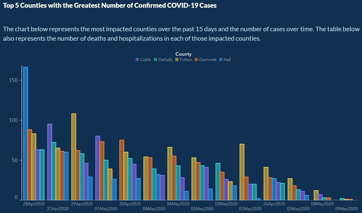
- Overall this looks like the heights of bars are going down.
- Dates are on the x-axis.
- Are covid cases going down over time?
Q Write in your own words what you see that is wrong with this graph. What is the story it is telling vs the real story in the data?
Graph detective
A great blog post about how you might correct this data (code is writen in R - but still a good overall revision of the previous, misleading plot.
Lucy D’Agostino McGowan. Graph detective. Live Free or Dichotomize. 17 May 2020.
————————
Maps and areas
This is a special type of data visualization. One common pitfall in visualizing data is mixing geographic area data with data about quantities.
Maps and areas - Example 1
Do you recognize this map? What does it show?
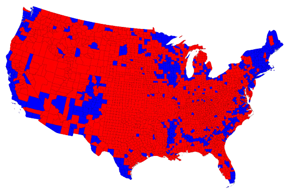
Lazaro Gamio. “Election maps are telling you big lies about small things”.
The Washington Post. 1 Nov 2016.
- This is the United States and each piece is the county.
- This election map was shown all over the place.
- It is very misleading.
- Each of these counties do not have the same number of people.
Alberto Cairo. Visual Trumpery talk.
There is a talk by Alberto Cairo that goes into this story.
Maps and areas - Example 2
Here is another way to represent this data that is more accurate to the actual population in each of states, or their electoral votes.
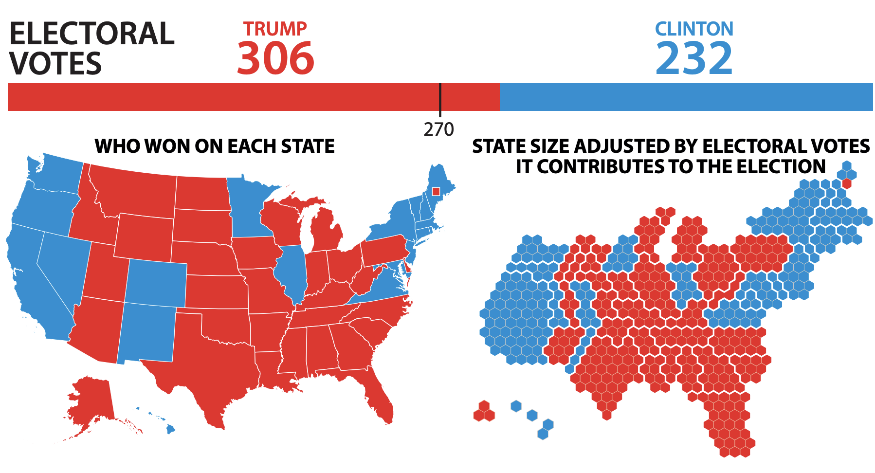
Alberto Cairo. Visual Trumpery talk.
- This graphic shows two different stories.
- Geographic areas do not decide elections
- Electoral votes do!
————————
Visualizing uncertainty
Visualizing uncertainty - Example 1
On December 19, 2014, the front page of Spanish national newspaper El País read *“Catalan public opinion swings toward ‘no’ for independence, says survey”.
Here is the data for that study:
response = ["No", "Yes", "No answer"]
rate = [45.3, 44.5, 10.2]
m_error = [2.95,2.95,2.95]

DF = pd.DataFrame()
DF['response'] = response
DF['rate'] = rate
DF['error']= m_error
DF| response | rate | error | |
|---|---|---|---|
| 0 | No | 45.3 | 2.95 |
| 1 | Yes | 44.5 | 2.95 |
| 2 | No answer | 10.2 | 2.95 |
fig = px.bar(DF,x='rate',y='response',color='response')
fig.show()
This representation of the data is misleading because the Margin of error is +/-2.95% at 95% confidence level. This means that we only know the information to within about 3%. The graph makes it look like the the no votes are winning!
Alberto Cairo. The truthful art: Data, charts, and maps for communication. New Riders, 2016.
Visualizing uncertainty - Example 1 - Margin of Error
We will redo this plot in a different style and report information about the margin of error!
fig = px.scatter(DF,x='rate',y='response',color='response',error_x='error')

fig.show()
By plotting the data with clear error bars, it makes it more clear how close the vote actually is.
Many people have a hard time thinking about margin of error. In the first plot it is hard to visualize how much overlap the margin of error gives us. In the second plot it is very clear!
Alberto Cairo. “Uncertainty and Graphicacy: How Should Statisticians Journalists and Designers Reveal Uncertainty in Graphics for Public Consumption?”, Power from Statistics: Data Information and Knowledge, 2017.
————————
Further reading - Miscommunication of Data
How Charts Lie
Getting Smarter about Visual Information - by Alberto Cairo
Calling Bullshit
The Art of Skepticism in a Data-Driven World - by Carl Bergstrom and Jevin West
Video - Alberto Cairo - How Charts Lie: Getting Smarter About Visual Information
————————
Data Privacy
The question of data privacy is complicated and rests on the idea of what amount of expected privacy are we entitled to when we put our data online.
Data Privacy - Case study:
AOL search data leak
This is quite an old example of data privacy issues. These issues are not new, we have been dealing with data privacy for many years. As a society we are still struggling to fix data privacy issues!
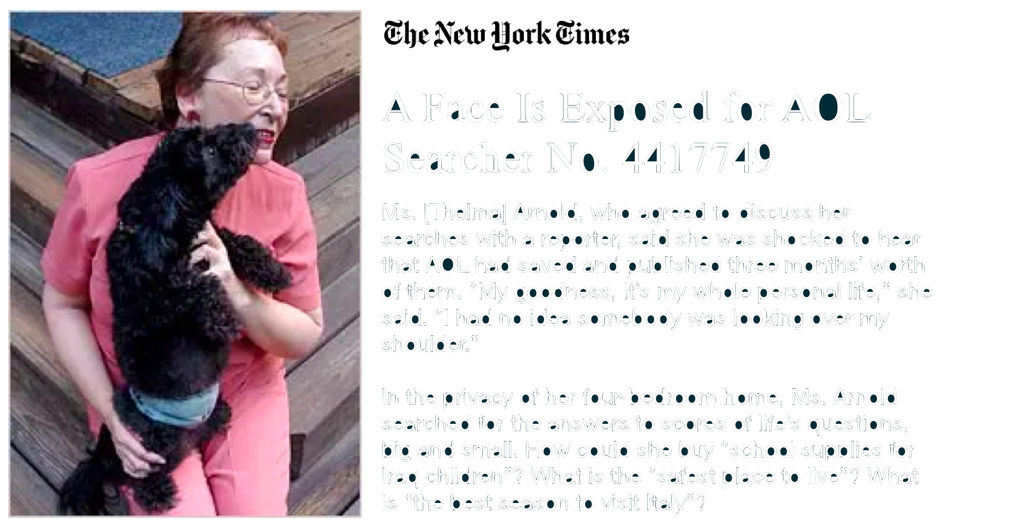
AOL saved and published three months of search data. In the data leak the names were not included in the data, but it was very easy to connect the names.
Even today our search data is being saved, unless you opt out. Think about all the things you search for in the privacy of your room? What if this information got released? How is this information being used even if it is not publically available?
- Read the fine print!
Michael Barbaro and Tom Zeller Jr. A Face Is Exposed for AOL Searcher No. 4417749.
New York Times. 9 August 2006.
- You should be very critical of where your data is coming from.
- Make sure it was sourced ethically!
Data Privacy - Case study:
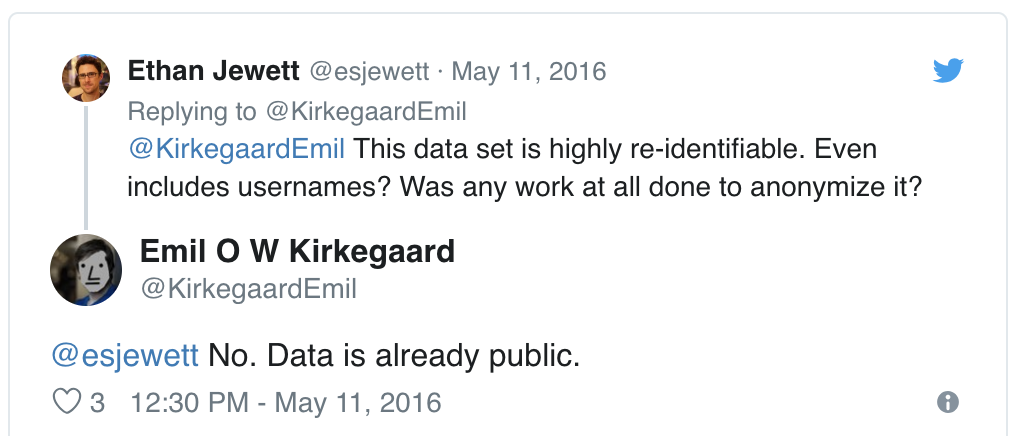
OK Cupid data breach
In 2016, researchers published data of 70,000 OkCupid users—including usernames, political leanings, drug usage, and intimate sexual details
Researchers didn’t release the real names and pictures of OKCupid users, but their identities could easily be uncovered from the details provided, e.g. usernames
Usernames were often either real names or reused across platforms that were easy to connect to a person.
Some may object to the ethics of gathering and releasing this data. However, all the data found in the dataset are or were already publicly available, so releasing this dataset merely presents it in a more useful form. - Researchers Emil Kirkegaard and Julius Daugbjerg Bjerrekær
When users gave this information was there an expectation of privacy? Did they think the data would be released in a more useful form for analysis?
In analysis of data that individuals willingly shared publicly on a given platform (e.g. social media), how do you make sure you don’t violate reasonable expectations of privacy?
Q When analyzing data that is publicly shared, how can you make sure that you are not violating a persons reasonable expectation of privacy? What do you think the rules should be here? How would you want your data treated?
Q Does the answer to the question “Should I scrape this data” vary based on what the data is about? Give two examples where the answer might be different.
Data Privacy - Case study:
Facebook & Cambridge Analytica
Infographic about what happened:
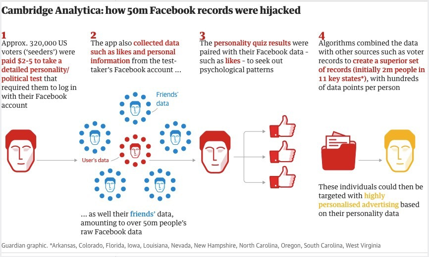
- About 320,000 US voters were paid to take a personality politics test
- The app also collected data about likes and personal information
- It also grabbed their friends data
- Even if you did not take the survey, your friends access to the survey might mean your data was included
- Algorithms combined the data to target people with highly personalized advertising based on their personality data.
People did not realize that this is how their data was going to be used. They presented data gathering as a personality quiz, hiding the true intent. All around there are ethical issues around this type of data collection and use!
Carole Cadwalladr and Emma Graham-Harrison. How Cambridge Analytica turned Facebook ‘likes’ into a lucrative political tool. The Guardian. 17 March 2018.
Video - Cambridge Analytica whistleblower: ‘We spent $1m harvesting millions of Facebook profiles’
Exercise 1
Consider the following visualization that was shared on Twitter:
You are going to construct the data by reading (approximate is okay) the numbers from the picture.
What is most misleading about this graph - essay answer
Create a data frame that can be used to re-construct this visualization. You may need to guess some of the numbers, that’s ok. You should first think about how many rows and columns you’ll need and what you want to call your variables.
Here is some code to get you started:
date = []
count_mask = []
count_nomask = []

DF = pd.DataFrame()
DF['date']=date
DF['count_mask']=count_mask
DF['count_nomask']=count_nomask
DF| date | count_mask | count_nomask |
|---|
Make a visualization of this data that is more accurate. Your visualization should more honestly tell the story.
fig = pd.line(DF,x= ,y= )What message is more clear in your visualization, compared to the one posted on twitter?
What, if any, useful information do these data and your visualization tell us about mask wearing and COVID? It’ll be difficult to set aside what you already know about mask wearing, but you should try to focus only on what this visualization tells. Feel free to also comment on whether that lines up with what you know about mask wearing.
Could there be confounding data? What can you actually say about the data as given?