Blue Q boxes are questions for you to answer by hand, in a notebook, with a pen. Not because I am old fashioned. Writing something down by hand is slow, and slow is the point: it is very hard to write an explanation you do not actually understand. You are welcome to use AI in this class for the mechanics of code, but these boxes are the part where you do the thinking yourself. Bring your written notes to class, I will ask to see them.
Green You Try boxes are optional code for you to work through. Nothing is collected and nothing is graded. They are there because you will learn more from changing a number and rerunning than from watching me do it.
Reading: Geron, chapter 4, the sections on Polynomial Regression and Learning Curves
Today we start with regression, which most of you already saw in DATA 101. That is on purpose. We are not here to learn regression again, we are here to use it as a work bench to study two problems that show up in every model you will ever build: underfitting and overfitting. Regression is a good place to do that because you can plot the data, plot the model, and see the whole thing at once. Once we get to neural networks in a few weeks you will not be able to see it anymore, so it is worth building your intuition now while you can still look at it.
*NOTE: In higher dimensional models we will not be able to plot the data or look at the solution! We will need to use and understand other measures to see how well our models perform.
The Data
We are going to make our own data, on purpose. When you make the data yourself you know the right answer, so you can tell whether the model found it.
Here we are using the function
y = \frac{x^2}{2} + x + 2
Then we create a random number generator object:
rng = np.random.default_rng(seed=42)
and use it to add noise to the data in two ways
rng.random((m, 1)) # Uniform distribution
rng.standard_normal((m, 1)) # Normal distribution
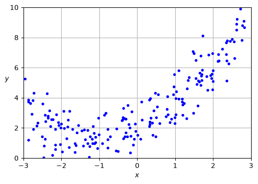
import numpy as npimport matplotlib.pyplot as pltrng = np.random.default_rng(seed=42)m =200# number of data pointsX =6* rng.random((m, 1)) -3# x between -3 and 3y =0.5* X**2+ X +2+ rng.standard_normal((m, 1)) # a parabola plus noiseplt.figure(figsize=(6, 4))plt.plot(X, y, "b.")plt.xlabel("$x$"); plt.ylabel("$y$", rotation=0)plt.axis([-3, 3, 0, 10]); plt.grid()plt.show()
Notice what we just did. The true relationship is
y = 0.5x^2 + x + 2
and everything else in that picture is noise we added on purpose. This is the answer the model is trying to find, and unlike real life, we know it! That is the whole reason for making our own data. When the model gives us something, we can check whether it is right.
Underfitting: a Straight Line Through a Curve
Here we are importing the LinearRegression package from sklearn, this is us choosing a model. When we choose a model we are thinking about our data and what model seems to match the given data!
Then we create the LinearRegression object and call .fit() on it to solve for the weights. This is like giving it
y = mx+b and then fitting to find m and b
Finally with those constants solved we are ready to call .predict() to use the model on new data.
Here we did not do test-train-validate split. The ONLY time I will skip this is when we are working through simple examples to build intuition.
Q1. Write this one out by hand
What does each line of the code above do? Write a one line description of each step in your notebook.
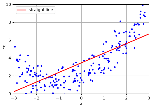
How did we do with this data? Does the model match the data? Why, in your own words?
This is underfitting. The model is too simple to represent the pattern that is actually there. A straight line cannot bend, and our data bends.
Look at where the errors are. On the left the line is too high, in the middle it is too low, on the right it is too high again. The errors are not scattered randomly around the line, they come in runs. That is your clue that the problem is the model and not the data. And notice that collecting more data will not help you here at all. You would just get more points that a straight line still cannot follow.
Measuring How Wrong We Are
So far we have been eyeballing it, and eyeballing only works when you can plot the whole thing. By Day 14 you will have models you cannot draw, so we need a number.
Start with one point. The model predicted something, the truth was something else, and the difference between them is the error or residual:
Now we want to represent all 200 residuals into one number. We cannot just add them up, because the positive and negative ones would cancel out and a terrible model could score zero error. So we square them first, then take the average. That is the mean squared error:
Squaring fixed the cancelling problem but it broke the units. If y is measured in dollars then MSE is in dollars squared, which is not a thing anybody can interpret. So we take the square root and get the root mean squared error:
RMSE = \sqrt{MSE}
RMSE is back in the same units as y, so you can say “we are off by about 1.6 on average” and have that mean something. This is why RMSE is what we will report most of the time, and it is what the learning curves below are plotting.
Q3. Write this one out by hand
Imagine you fit a model to five data points and it gave you the predictions \hat{y} in the table below.
x
y (actual)
\hat{y} (predicted)
1
4
3
2
4
5
3
10
7
4
6
9
5
11
11
a. Plot the five data points and draw in the model’s predictions. Show each residual as a little vertical line between the point and the prediction.
b. Add up the residuals. What do you get? Does that mean the model is perfect?
c. Now square them, average, and take the square root. What is the RMSE?
d. The RMSE comes out to a whole number here, which never happens with real data. Why did it work out so cleanly this time?
from sklearn.metrics import root_mean_squared_error# predict on the data we trained ony_predicted = lin_reg.predict(X)# one number for how wrong we arermse = root_mean_squared_error(y, y_predicted)print("RMSE of the straight line:", round(rmse, 3))print("for comparison, the noise we added had a standard deviation of 1.0")
RMSE of the straight line: 1.619
for comparison, the noise we added had a standard deviation of 1.0
So the straight line is off by about 1.6 on average, and we know the noise alone accounts for about 1.0 of that. The gap between those two numbers is the part the model is getting wrong all by itself.
A version trap you will hit if you search online
Older tutorials, and a lot of code you will find on the internet, compute RMSE like this:
mean_squared_error(y, y_predicted, squared=False) # this no longer works!
The squared=False option was removed from scikit-learn. Use root_mean_squared_error() instead, the way we did above. If you copy something from Stack Overflow or AI and get TypeError: got an unexpected keyword argument 'squared', this is why.
This number is not the honest one
We just computed the error on the same data we trained on. This is the Day 1 rule coming back: you only get to use your test set once, and more generally, a score on data the model has already seen tells you almost nothing about data it has not.
Polynomial Regression
The trick is simple. We do not need a fancier model, we just need to feed the linear model better features. If we give it xandx^2, a linear model can fit a parabola.
from sklearn.preprocessing import PolynomialFeatures# Step 1: build the new features. This is the only new idea here.poly_features = PolynomialFeatures(degree=2, include_bias=False)X_poly = poly_features.fit_transform(X)print("original first point :", X[0])print("with x squared added :", X_poly[0])# Step 2: choose the model. Same LinearRegression as before!lin_reg = LinearRegression()# Step 3: fit it, this time on the new featureslin_reg.fit(X_poly, y)# Step 4: look at what it learnedm2 =round(lin_reg.coef_[0][1], 2)m1 =round(lin_reg.coef_[0][0], 2)b =round(lin_reg.intercept_[0], 2)print("\nlearned: y =", m2, "x^2 +", m1, "x +", b)print("truth : y = 0.5 x^2 + 1 x + 2")
original first point : [1.64373629]
with x squared added : [1.64373629 2.701869  ]

learned:  y = 0.51 x^2 + 1.11 x + 2.01
truth  :  y = 0.5 x^2 + 1 x + 2
It found it! We started with y = 0.5x^2 + x + 2 and the model came back with 0.51, 1.11, and 2.01. Not exact, because we added noise and the model only sees 200 points, but very close.
There is something sneaky going on here that is worth naming. We did not switch to a fancier model. It is still LinearRegression, the same one that drew the straight line. All we did was hand it a new feature, x^2, alongside x. The model is still linear in the features we gave it, and that is why this trick works. Keep this idea in your brain, because a lot of machine learning is choosing what to feed a model rather than building a cleverer model.
Overfitting: Going Much Too Far
Q4. Write this one out by hand
Below we use a Python for loop. Explain the parts of a for loop, and say what values the dummy variables degree, style, and width take as the loop runs.
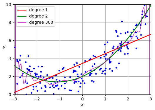
from sklearn.preprocessing import StandardScalerplt.figure(figsize=(6, 4))plt.plot(X, y, "b.")for degree, style, width in [(1, "r-", 2), (2, "g-", 2), (300, "m-", 1)]:# Step 1: build the features for this degree poly_features = PolynomialFeatures(degree=degree, include_bias=False) X_poly = poly_features.fit_transform(X)# Step 2: scale them. With degree 300, x^300 is an enormous number and the# fit falls apart without this. scaler = StandardScaler() X_scaled = scaler.fit_transform(X_poly)# Step 3: choose the model and fit it lin_reg = LinearRegression() lin_reg.fit(X_scaled, y)# Step 4: to predict on NEW data we have to put it through the exact same# two transforms first, in the same order. Note .transform() and not# .fit_transform() here, we are reusing what we learned from the training data. X_new_poly = poly_features.transform(X_new) X_new_scaled = scaler.transform(X_new_poly) y_pred = lin_reg.predict(X_new_scaled) plt.plot(X_new, y_pred, style, linewidth=width, label=f"degree {degree}")plt.xlabel("$x$"); plt.ylabel("$y$", rotation=0)plt.axis([-3, 3, 0, 10]); plt.legend(); plt.grid()plt.show()
Degree 300 is a disaster, and it is a disaster that looks fantastic.
That totally crazy curve passes closer to the training points than either of the other two models. If you scored it on the training data it would beat everything else you have tried. But look at what it does between the points, and imagine asking it to predict at x = 2.5. You would not trust that answer, and you would be right not to.
Q5. Write this one out by hand
Estimate the error, or residual, just by looking at the graph, if you tried to use the degree 300 curve at x = 2.5.
This is overfitting. The model has enough flexibility to memorize the noise, so that is what it did. This is exactly the Day 1 problem: a number that looks great on data the model has already seen tells you almost nothing about data it has not.
Learning Curves
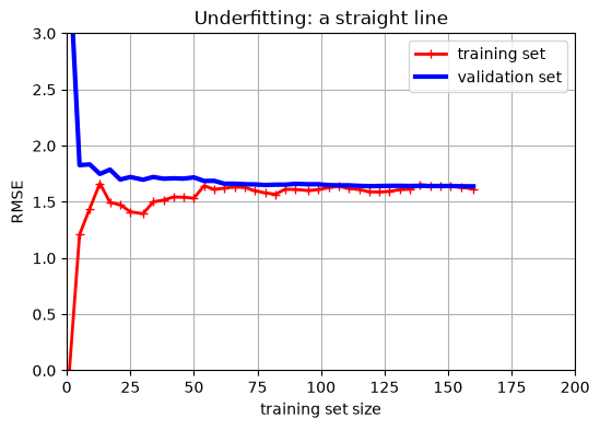
A learning curve plots error against how much training data you used, for both the training set and the validation set. It is the fastest way to see which problem you have, and you can look at the learning curve while you are training your model!
Q6. Write this one out by hand
Below we use a Python function. Explain in general how Python functions work, and what all the parts of a function are.
Then: how would you write a Python function that takes an x value as input and returns y = x^2?
NOTE: Here we need both a training and validation set!!!
from sklearn.model_selection import learning_curvedef plot_learning_curve(model, X, y, title): train_sizes, train_scores, valid_scores = learning_curve( model, X, y.ravel(), train_sizes=np.linspace(0.01, 1.0, 40), cv=5, scoring="neg_root_mean_squared_error") train_errors =-train_scores.mean(axis=1) valid_errors =-valid_scores.mean(axis=1) plt.figure(figsize=(6, 4)) plt.plot(train_sizes, train_errors, "r-+", linewidth=2, label="training set") plt.plot(train_sizes, valid_errors, "b-", linewidth=3, label="validation set") plt.xlabel("training set size"); plt.ylabel("RMSE") plt.title(title); plt.legend(); plt.grid(); plt.axis([0, 200, 0, 3]) plt.show()# the straight line from earlierlin_model = LinearRegression()plot_learning_curve(lin_model, X, y, "Underfitting: a straight line")
Some notes about the code:
y.ravel() just flattens the y-data to make sure it is !D.
learning_curve is a special function from sklearn. Try typing learning_curve? in your notebook to learn more.
Below we take the NEGATIVE mean of the scores, this is because by default sklearn has a scoring convention that is is “higher is better,” but usually we are trying to minimize the error, so our convention is lower is better.
#learning_curve?
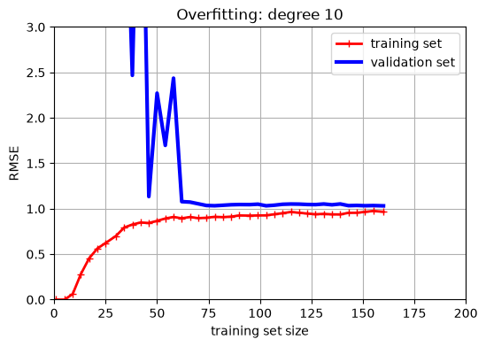
from sklearn.pipeline import make_pipeline# learning_curve refits the model many times on different amounts of data, so we# hand it the recipe rather than an already-fitted model. make_pipeline glues the# two steps together into one object that knows to do the features first and then# the regression.poly_model = make_pipeline( PolynomialFeatures(degree=10, include_bias=False), LinearRegression())plot_learning_curve(poly_model, X, y, "Overfitting: degree 10")
Learning curves are the fastest way to tell your two problems apart, so it is worth learning to read them.
Underfitting (the first plot): both curves climb, meet, and flatten out high. The training error is bad and the validation error is bad, and they end up close together. The flat part is the important bit. It says that adding more data will not help you, because the model already cannot fit the data it has. To fix this you need a better model or better features.
Overfitting (the second plot): the training error stays low, the validation error sits well above it, and there is a visible gap between the two curves. That gap is the tell. The model does well on what it has seen and worse on what it has not. To fix this you can simplify the model, add regularization (Day 3!), or get more data, which actually does help here.
A rough rule for reading any learning curve: high and together means underfitting, low with a gap means overfitting.
You Try: optional code
Nothing here is collected. Work through it if you want the idea to stick.
The two examples above used degree 1 and degree 10. Before you run anything, guess what the learning curve will look like for degree 2, which is the degree that matches how we built the data. Then run it:
degree2_model = make_pipeline(
    PolynomialFeatures(degree=2, include_bias=False),
    LinearRegression())

plot_learning_curve(degree2_model, X, y, "Degree 2, the right answer")
Were you right? Now try degree 25 and see if you can explain what happened.
Then go back and change m = 200 to m = 40 at the top, rerun everything, and see which of these two problems gets worse when you have less data. That last one is the whole idea behind this week’s homework.
Before Next Class
1.In your lecture notes notebook, add your hand writen notes and answers to the questions. 2. Finish HW 1, due Sunday 9/6 at 11:59pm. It covers Day 1 and Day 2. 3. Read Geron chapter 4, the section on Regularized Linear Models. 4. Watch the Day 3 video on the class website.
On Day 3 we pick up right where we stopped. We saw today that overfitting comes from a model with too much freedom, so next time we look at what happens when you deliberately take some of that freedom away. That is regularization, and it is one of the most useful tools you will learn in this class.