# We will just go ahead and import all the useful packages first.
import numpy as np
import sympy as sp
import pandas as pd
import matplotlib.pyplot as pltMath for Data Science
Variables and Functions
Important Information
- Email: joanna_bieri@redlands.edu
- Office Hours take place in Duke 209 unless otherwise noted – Office Hours Schedule
Today’s Goals:
- Deeper Thinking: What is a function? What is a variable?
- Overview: Types of Functions No BS Guide to Math and Physics Functions Reference (p.63)
- Introduction to Empirical Modeling.
- Least Squares Regression
What is a function?
Seriously… can you describe this idea.
Give a specific example of a mathematical formula for a function.
Can you give a general definition for a function?
Definition: Function, Domain, and Range
Let \(A\) and \(B\) be two sets. A function \(f\) from \(A\) to \(B\) is a relation between \(A\) and \(B\) such that for each \(a\) in \(A\) there is one and only one associated \(b\) in B. The set \(A\) is called the domain of the function, \(B\) is called its range.
Often a function is denoted as \(y = f(x)\) or simply \(f(x)\).
Common Function Types:
LINEAR - Line \[ y = f(x) = mx+b \]
NON-LINEAR - Square \[ y = f(x) = ax^2 +b \] - Square Root \[ y = f(x) = a\sqrt{x} +b\] - Absolute Value \[ y = f(x) = a|x|+b\] - Polynomials higher than degree 1 \[ y = f(x) = a_0 + a_1x + a_2x^2+a_3x^3+\dots\] - Sine \[ y = f(x) = a\sin(bx)+c\] - Cosine \[ y = f(x) = a\cos(bx)+c\] - Exponential \[y = f(x) = ae^{bx}+c\] - Natural Logarithm \[y = f(x) = a\ln{bx}+c\]
Each of these basic types of functions allows for transformations. As we choose different coefficients \(a, b, c\), we can change the location and some of the shape of the function. More complicated functions can be build out of these basic function times. For example:
- Rational Functions \[ y = f(x) = \frac{P(x)}{Q(x)} \] where \(P(x)\) and \(Q(x)\) are polynomials.
Functions can have more than one variable!
In the examples above we see that our dependent variable \(y\) is a function of only one independent variable \(x\). Sometimes we want our functions to allow for more variables.
\[ y = \beta_0+\beta_1X_1+\beta_2X_2+\beta_3X_3+\dots \]
In this example \(\beta_n\) are all coefficients and \(X_n\) are all variables. We can have as many variables as we want!
Why do we care?!?
Having a good instinct for functions is important when choosing models in data science. We will explore these functions in the context of Empirical Modeling. Here are just a few areas that rely on knowing your functions:
- Predictive Modeling
- Feature Engineering
- Machine Learning - Cost Functions
- Data Visualization
Empirical Modeling
Empirical Modeling is the are of establishing how one variable depends on another using data. Sometimes, the goal of this type of modeling is to fit a line or a curve though your data that will allow you to predict results for instances where you do not have data. Other times, the goal is just to establish that there is a dependence (correlation) between two variables.
TODAY How do we actually fit a line through our data?
Last class we used the command
coefficients = np.polyfit(x, y, 1)to get the coefficients of a degree one polynomial through our data (line \(y=ax+b\)). It is fine to take advantage of the power of Python, but even better is to truly understand what these commands are doing.
A discussion of Linear Dependence
What does it mean if we say data contains a linear dependence?
Consider the following two graphs
In which example would we say that \(y\) is highly dependent on \(x\)? Why?
In which example would we say that \(y\) does not seem to depend on \(x\) at all? Why?
# Example 1
x1 = np.random.rand(20)
y1 = np.random.rand(20)

plt.plot(x1,y1,'k.')
plt.xlabel('x')
plt.ylabel('y')
plt.show()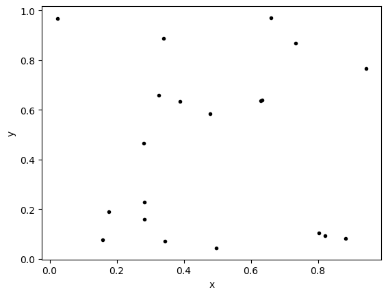
# Example 2
x2 = np.arange(0,1,.05)
y2 = x2

plt.plot(x2,y2,'k.')
plt.xlabel('x')
plt.ylabel('y')
plt.show()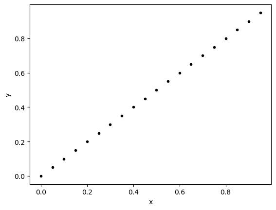
# Example 3
x3 = np.arange(0,1,.05)
noise = np.random.rand(len(x3))
y3 = x3+noise

plt.plot(x3,y3,'k.')
plt.xlabel('x')
plt.ylabel('y')
plt.show()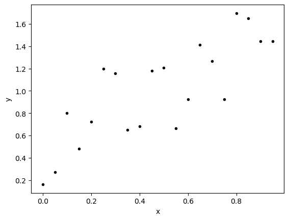
How can we MEASURE the degree of linear dependence between two variables.
It is fine to look at a graph and say - I SEE DEPENDENCE! - it is a more convincing statement if you can measure that dependence.
Covariance
Covariance measures how much two variables vary together. To measure change we need a reference point. We will choose the average of the data \((\bar{x},\bar{y})\) as our reference. So \(\bar{x}\) is the average of all the \(x\) values and \(\bar{y}\) is the average of all the \(y\) values. Then for each point in the data we can ask, how far away are you in each direction from this average. Given a point \(x_i,y_i\) in our data calculate:
\[(x_i-\bar{x})\] \[(y_i-\bar{y})\]
If we think about example 2 (the line with positive slope), we would be calculating the differences between each of the black points and the red point below.
# Example 2
x2 = np.arange(0,1,.05)
y2 = x2

x2_bar = np.average(x2)
y2_bar = np.average(y2)

plt.plot(x2,y2,'k.')
plt.plot(x2_bar,y2_bar,'ro')
plt.xlabel('x')
plt.ylabel('y')
plt.show()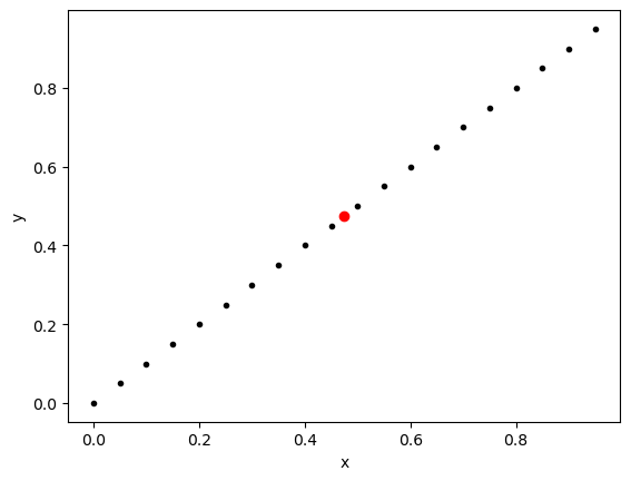
DF2 = pd.DataFrame()

DF2['x'] = x2
DF2['y'] = y2
DF2['x-bar(x)'] = x2-x2_bar
DF2['y-bar(x)'] = y2-y2_bar
DF2['mult'] = DF2['x-bar(x)']*DF2['y-bar(x)']

display(DF2)| x | y | x-bar(x) | y-bar(x) | mult | |
|---|---|---|---|---|---|
| 0 | 0.00 | 0.00 | -0.475 | -0.475 | 0.225625 |
| 1 | 0.05 | 0.05 | -0.425 | -0.425 | 0.180625 |
| 2 | 0.10 | 0.10 | -0.375 | -0.375 | 0.140625 |
| 3 | 0.15 | 0.15 | -0.325 | -0.325 | 0.105625 |
| 4 | 0.20 | 0.20 | -0.275 | -0.275 | 0.075625 |
| 5 | 0.25 | 0.25 | -0.225 | -0.225 | 0.050625 |
| 6 | 0.30 | 0.30 | -0.175 | -0.175 | 0.030625 |
| 7 | 0.35 | 0.35 | -0.125 | -0.125 | 0.015625 |
| 8 | 0.40 | 0.40 | -0.075 | -0.075 | 0.005625 |
| 9 | 0.45 | 0.45 | -0.025 | -0.025 | 0.000625 |
| 10 | 0.50 | 0.50 | 0.025 | 0.025 | 0.000625 |
| 11 | 0.55 | 0.55 | 0.075 | 0.075 | 0.005625 |
| 12 | 0.60 | 0.60 | 0.125 | 0.125 | 0.015625 |
| 13 | 0.65 | 0.65 | 0.175 | 0.175 | 0.030625 |
| 14 | 0.70 | 0.70 | 0.225 | 0.225 | 0.050625 |
| 15 | 0.75 | 0.75 | 0.275 | 0.275 | 0.075625 |
| 16 | 0.80 | 0.80 | 0.325 | 0.325 | 0.105625 |
| 17 | 0.85 | 0.85 | 0.375 | 0.375 | 0.140625 |
| 18 | 0.90 | 0.90 | 0.425 | 0.425 | 0.180625 |
| 19 | 0.95 | 0.95 | 0.475 | 0.475 | 0.225625 |
When we multiply together
\[(x_i-\bar{x})(y_i-\bar{y})\]
we see we get all positive values and if we added these up we would get an even more positive value!
sum(DF2['mult'])1.6625Now lets look at the random example, we would be calculating the differences between each of the black points and the red point below.
# Example 1
x1 = np.random.rand(20)
y1 = np.random.rand(20)

x1_bar = np.average(x1)
y1_bar = np.average(y1)

plt.plot(x1,y1,'k.')
plt.plot(x1_bar,y1_bar,'ro')
plt.xlabel('x')
plt.ylabel('y')
plt.show()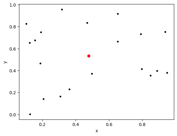
DF1 = pd.DataFrame()

DF1['x'] = x1
DF1['y'] = y1
DF1['x-bar(x)'] = x1-x1_bar
DF1['y-bar(x)'] = y1-y1_bar
DF1['mult'] = DF1['x-bar(x)']*DF1['y-bar(x)']

display(DF1)| x | y | x-bar(x) | y-bar(x) | mult | |
|---|---|---|---|---|---|
| 0 | 0.653637 | 0.664976 | 0.175270 | 0.130625 | 0.022895 |
| 1 | 0.848970 | 0.354992 | 0.370603 | -0.179360 | -0.066471 |
| 2 | 0.948687 | 0.380802 | 0.470320 | -0.153549 | -0.072217 |
| 3 | 0.889209 | 0.398229 | 0.410842 | -0.136122 | -0.055925 |
| 4 | 0.468791 | 0.835624 | -0.009576 | 0.301272 | -0.002885 |
| 5 | 0.937210 | 0.752300 | 0.458842 | 0.217948 | 0.100004 |
| 6 | 0.103272 | 0.825424 | -0.375095 | 0.291073 | -0.109180 |
| 7 | 0.652252 | 0.917452 | 0.173885 | 0.383101 | 0.066616 |
| 8 | 0.155324 | 0.675499 | -0.323043 | 0.141147 | -0.045597 |
| 9 | 0.124695 | 0.652675 | -0.353672 | 0.118324 | -0.041848 |
| 10 | 0.316968 | 0.957527 | -0.161399 | 0.423176 | -0.068300 |
| 11 | 0.191682 | 0.749896 | -0.286686 | 0.215545 | -0.061794 |
| 12 | 0.205794 | 0.141264 | -0.272574 | -0.393087 | 0.107145 |
| 13 | 0.188229 | 0.464932 | -0.290138 | -0.069419 | 0.020141 |
| 14 | 0.797300 | 0.414390 | 0.318933 | -0.119962 | -0.038260 |
| 15 | 0.308188 | 0.163449 | -0.170179 | -0.370902 | 0.063120 |
| 16 | 0.362878 | 0.230844 | -0.115489 | -0.303508 | 0.035052 |
| 17 | 0.125225 | 0.002329 | -0.353142 | -0.532022 | 0.187880 |
| 18 | 0.792340 | 0.733018 | 0.313973 | 0.198666 | 0.062376 |
| 19 | 0.496692 | 0.371406 | 0.018325 | -0.162946 | -0.002986 |
Now when we multiply together
\[(x_i-\bar{x})(y_i-\bar{y})\]
we see we get some positive and some negative values. These will cancel each other out somewhat when we add them up.
sum(DF1['mult'])0.0997650820324397YOU TRY
Redo this experiment but now with a FOURTH example \(y=-x\) to see what happens when our straight line is decreasing slope.
# Your Code Here!
Sample Covariance Equation
\[ \hat{C}ov(x,y) = \frac{\sum_i (x_i-\bar{x})(y_i-\bar{y})}{(n-1)}\]
where \(n\) is the sample size. We divide by \(n\) so that we are not biased by the number of samples. (EG if we had a lot of positive samples this might add up to a really big number only because of the number of samples.)
If \(\hat{C}ov(x,y)\) is positive then as \(x\) increases in general \(y\) increases. If \(\hat{C}ov(x,y)\) is negative then as \(x\) increases in general \(y\) decreases. If \(\hat{C}ov(x,y)\) is zero then there is no indication of a linear dependence.
np.cov(x1, y1)[0, 1]0.005250793791181033np.cov(x2,y2)[0,1]0.08750000000000001np.cov(x3,y3)[0,1]0.10362060208148272YOU TRY
Calculate the sample covariance for your FOURTH example \(y=-x\)
# Your code hereIn the examples here we see that all the numbers are similar because all of the data for the experiments was between zero and one. If we are comparing data sets with very different magnitudes, then we would have to be careful. Thus we define
Sample Correlation Coefficient \(r\)
\[r = \frac{\hat{C}ov(x,y)}{s_xs_y} \]
where \(s_x\) and \(s_y\) are the standard deviations for our data in \(x\) and \(y\)
np.corrcoef(x1,y1)[0,1]0.06121026223856972np.corrcoef(x2,y2)[0,1]1.0np.corrcoef(x3,y3)[0,1]0.7996121165667915YOU TRY
Calculate the sample correlation for your FOURTH example \(y=-x\)
# Your code hereFitting a line to data – using least-squares.
Consider the not quite linear data below
xdata = np.arange(0,1,.05)
noise = np.random.rand(len(xdata))
ydata = xdata+noise

plt.plot(xdata,ydata,'k.')
plt.xlabel('x')
plt.ylabel('y')
plt.show()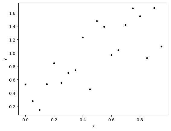
If we were each asked to draw a straight line of best fit, what would you do? Are there some rules you would try to follow? Can you even describe all the things you are doing in your mind, behind the scenes as you do this?
Least-Squares Criterion
The goal is to minimize the sum of square distances between the line \(\hat{y}=\beta_0+\beta_1x\) and the data point values \(y\). Lets look at this is parts:
- What is the distance between \(y\) and \(\hat{y}\) for each point in the data?
\[y_i - \hat{y}_i = y_i - (\beta_0+\beta_1x_i)\]
This is also called the residual or error for point \(i\) in our data.
- What is the square distance?
\[(y_i - (\beta_0+\beta_1x_i))^2\]
We just square the residual or error for point \(i\) in our data.
- How do we add these up?
Using the summation notation:
\[\sum_i (y_i - (\beta_0+\beta_1x_i))^2\]
Now we are adding up the square error for all of the points in the data.
- How can we minimize this?
Well, we might have to wait until we get some calculus under our belt before we can really see what the calculation does here. But this is a quadratic equation for \(\beta_0\) and \(\beta_1\). We look for points on this surface that minimize the sum of square errors.
Here is a visualization of this
# Create the symbols
b0, b1 = sp.symbols('b0,b1')

# Define the function to plot
f = 0
for x,y in zip(xdata,ydata):
    f = f + (y-(b0 + b1*x))**2

# Look at the function
f
\(\displaystyle \left(0.530870958882541 - b_{0}\right)^{2} + \left(- b_{0} - 0.85 b_{1} + 0.925992175281593\right)^{2} + \left(- b_{0} - 0.6 b_{1} + 0.970036336823818\right)^{2} + \left(- b_{0} - 0.45 b_{1} + 0.458720107826077\right)^{2} + \left(- b_{0} - 0.35 b_{1} + 0.744585123865976\right)^{2} + \left(- b_{0} - 0.3 b_{1} + 0.703591394990425\right)^{2} + \left(- b_{0} - 0.25 b_{1} + 0.554176339151861\right)^{2} + \left(- b_{0} - 0.2 b_{1} + 0.849082320711575\right)^{2} + \left(- b_{0} - 0.15 b_{1} + 0.535307615282127\right)^{2} + \left(- b_{0} - 0.1 b_{1} + 0.147678587706408\right)^{2} + \left(- b_{0} - 0.05 b_{1} + 0.277445792373293\right)^{2} + 1.08449412054246 \left(- 0.960254606136012 b_{0} - 0.624165493988408 b_{1} + 1\right)^{2} + 1.20223174628573 \left(- 0.912023237926429 b_{0} - 0.866422076030108 b_{1} + 1\right)^{2} + 1.52722562496597 \left(- 0.809186071780217 b_{0} - 0.323674428712087 b_{1} + 1\right)^{2} + 1.94354444236085 \left(- 0.717303189651038 b_{0} - 0.394516754308071 b_{1} + 1\right)^{2} + 2.01600051518579 \left(- 0.704295122282986 b_{0} - 0.49300658559809 b_{1} + 1\right)^{2} + 2.18907002383831 \left(- 0.675880898916964 b_{0} - 0.337940449458482 b_{1} + 1\right)^{2} + 2.40768282595496 \left(- 0.644466522713594 b_{0} - 0.515573218170875 b_{1} + 1\right)^{2} + 2.7921213569506 \left(- 0.59845686707765 b_{0} - 0.448842650308238 b_{1} + 1\right)^{2} + 2.80627801859174 \left(- 0.596945458890127 b_{0} - 0.537250913001114 b_{1} + 1\right)^{2}\)
# Create the plot
my_plot=sp.plotting.plot3d(f, (b0, -1, 3), (b1, -1, 2))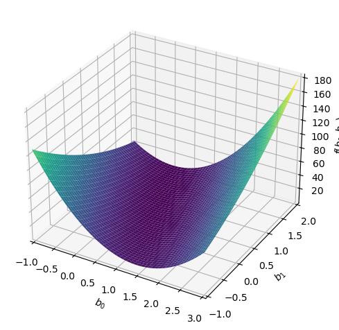
If we solve (using calculus) we find that
\[\beta_1 = \frac{n\sum_i x_iy_i-\sum_i x_i\sum_iy_i}{n\sum_ix_i^2-(\sum_ix_i)^2)}\]
\[\beta_0= \bar{y}-\beta_1\bar{x}\]
where \(\bar{x}\) and \(\bar{y}\) are the averages of the \(x_i\) and \(y_i\) data points respectively. WHAT A MESS :)
Python is Amazing – np.polyfit()
Luckily for us, we don’t have to do this calculation by hand. We can us polyfit to get the line. Below we will have python calculate the coefficients for us and then we will plot the resulting line.
BEWARE - np.polyfit() returns the coefficients in reverse order [beta1,beta0]
betas = np.polyfit(xdata,ydata,1)xfit = xdata
yfit = betas[0]*xfit+betas[1]
plt.plot(xdata,ydata,'k.')
plt.plot(xfit,yfit,'b-')
plt.xlabel('x')
plt.ylabel('y')
plt.show()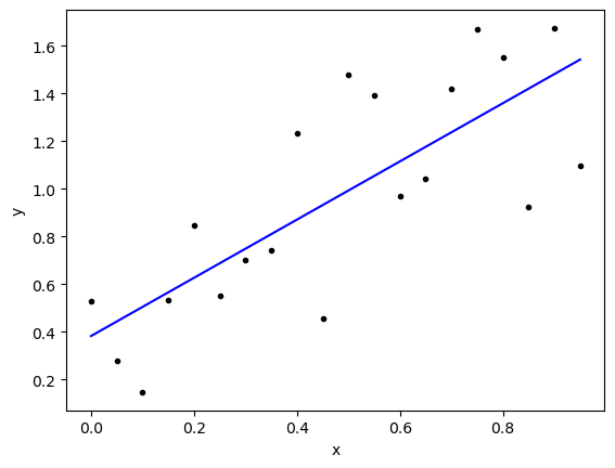
PAUSE - What do we have so far?
Covariance np.cov() will measure how much the points in a sample data set vary together.
Correlation np.corcoeff() gives us a coefficient to tell us how correlated the data is - “normalizes” for the magnitude of the numbers.
We can find a line of best fit (Least Squares) np.polyfit(x,y,1)
BUT How good is the fit?
Consider the picture below. Doesn’t it seem important to measure how close our line actually is to each of our data points?
# Data from Example 2
betas2 = np.polyfit(x2,y2,1)

xfit2 = x2
yfit2 = betas2[0]*xfit+betas2[1]

plt.plot(x2,y2,'k.')
plt.plot(xfit2,yfit2,'b-')
plt.xlabel('x')
plt.ylabel('y')
plt.show()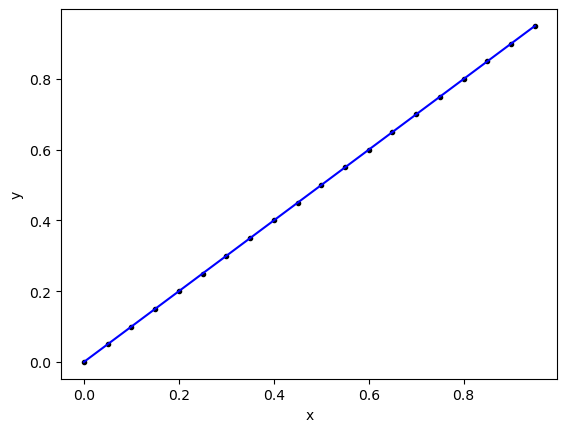
\(R^2\) A measure of fit.
\(R^2\) measures the amount of variation in the data that is explained by the model. We can compare the model data (the line) and the sample data (the points). Here are some things we might consider:
How much of the variation in the data IS NOT described by the model?
We can look at the distance between the line and each of the sample points to see the error in the model or residual - aka Residual sum of squares
\[SS_{res} = \sum_i(y_i-\hat{y}_i)^2 \]
How much of the variation in the data IS described by the model?
We can look at the difference between the line and the average (or mean) of the data.
\[SS_{reg} = \sum_i(\hat{y}_i-\bar{y})^2 \]
\(R^2\) is defined as
\[R^2 = \frac{SS_{reg}}{SS_{reg}+SS_{res}} = \frac{SS_{reg}}{SS_{total}} \]
so \(R^2\) measures the ratio of the variation that is explained by the model to the total variation in the data.
- if \(R^2=0\) then none of the data’s variation is explained by the model.
- if \(R^2=1\) the all of the data’s variation is explained by the model.
from sklearn.metrics import r2_scorer2_score(ydata,yfit)0.594642813150771r2_score(y2,yfit2)1.0Your Homework - Predict Viewership for the Show X-files
Below is some data for viewership of the TV show The X-files. It was SUPER popular in the 90’s. The first few cells below gather the data and plot it. You can just run these cells.
https://en.wikipedia.org/wiki/List_of_The_X-Files_episodes
# We are going to scrape some data from wikipedia:
DF_list = pd.read_html('https://en.wikipedia.org/wiki/List_of_The_X-Files_episodes')
viewers = list(DF_list[1]['U.S. viewers (millions)'].apply(lambda x: float(x.split('[')[0])))
viewers += list(DF_list[2]['U.S. viewers (millions)'].apply(lambda x: float(x.split('[')[0])))
weeks = list(DF_list[1]['No. overall'].apply(lambda x: float(x)))
weeks += list(DF_list[2]['No. overall'].apply(lambda x: float(x)))

# You can look to see what is in the data
DF = pd.DataFrame()
DF['Week'] = weeks
DF['Viewers'] = viewers
DF| Week | Viewers | |
|---|---|---|
| 0 | 1.0 | 12.0 |
| 1 | 2.0 | 11.1 |
| 2 | 3.0 | 11.1 |
| 3 | 4.0 | 9.2 |
| 4 | 5.0 | 10.4 |
| 5 | 6.0 | 8.8 |
| 6 | 7.0 | 9.5 |
| 7 | 8.0 | 10.0 |
| 8 | 9.0 | 10.7 |
| 9 | 10.0 | 8.8 |
| 10 | 11.0 | 10.4 |
| 11 | 12.0 | 11.1 |
| 12 | 13.0 | 10.8 |
| 13 | 14.0 | 11.1 |
| 14 | 15.0 | 12.1 |
| 15 | 16.0 | 11.5 |
| 16 | 17.0 | 9.2 |
| 17 | 18.0 | 11.6 |
| 18 | 19.0 | 11.5 |
| 19 | 20.0 | 12.5 |
| 20 | 21.0 | 13.4 |
| 21 | 22.0 | 13.7 |
| 22 | 23.0 | 12.5 |
| 23 | 24.0 | 14.0 |
| 24 | 25.0 | 16.1 |
| 25 | 26.0 | 15.9 |
| 26 | 27.0 | 14.8 |
| 27 | 28.0 | 13.4 |
| 28 | 29.0 | 13.9 |
| 29 | 30.0 | 15.5 |
| 30 | 31.0 | 15.0 |
| 31 | 32.0 | 15.3 |
| 32 | 33.0 | 15.2 |
| 33 | 34.0 | 16.1 |
| 34 | 35.0 | 14.2 |
| 35 | 36.0 | 16.2 |
| 36 | 37.0 | 14.7 |
| 37 | 38.0 | 17.7 |
| 38 | 39.0 | 17.8 |
| 39 | 40.0 | 15.9 |
| 40 | 41.0 | 17.5 |
| 41 | 42.0 | 16.5 |
| 42 | 43.0 | 17.1 |
| 43 | 44.0 | 15.7 |
| 44 | 45.0 | 12.9 |
| 45 | 46.0 | 14.0 |
| 46 | 47.0 | 12.9 |
| 47 | 48.0 | 14.5 |
| 48 | 49.0 | 16.6 |
# Here is a plot of the data
x = np.array(DF['Week'])
y = np.array(DF['Viewers'])

plt.plot(x,y,'k.')
plt.grid()
plt.title('Viewers of X-files as a function of week - first two seasons')
plt.xlabel('Weeks')
plt.ylabel('Viewers')
plt.show()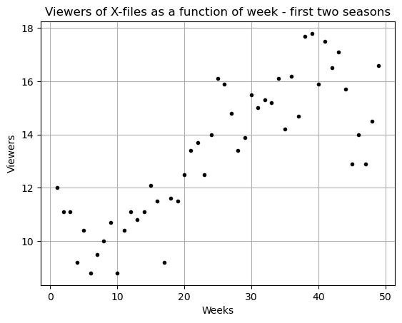
Please answer the following questions:
- Does there seem to be a relationship between the week number and the viewership?
- What do the sample covariance and sample correlation tell you about this data? Explain why your answer make sense.
- Find a straight line that fits this data (Linear Regression).
- Write down the equation you found.
- Plot the linear fit and the original data on the same plot.
- How does it look?
- Based on your line what should viewership in the first week of the third season be?
- Calculate the \(R^2\) value and talk about what this means in terms of your data and your linear fit.
EXTRA - Below I load data for season three of the series. How well does your linear fit match season three. If you did a linear fit just on season three would you have the same line or a different line? WHat does the difference in these lines mean?f
# Your code hereThis is where you can type in answers - double click to get access!
# And here# And here# We are going to scrape some data from wikipedia:
viewers3 = list(DF_list[3]['U.S. viewers (millions)'].apply(lambda x: float(x.split('[')[0])))
weeks3 = list(DF_list[3]['No. overall'].apply(lambda x: float(x)))
# You can look to see what is in the data
DF3 = pd.DataFrame()
DF3['Week'] = weeks3
DF3['Viewers'] = viewers3
DF3| Week | Viewers | |
|---|---|---|
| 0 | 50.0 | 19.94 |
| 1 | 51.0 | 17.20 |
| 2 | 52.0 | 15.57 |
| 3 | 53.0 | 15.38 |
| 4 | 54.0 | 16.72 |
| 5 | 55.0 | 14.83 |
| 6 | 56.0 | 15.91 |
| 7 | 57.0 | 15.90 |
| 8 | 58.0 | 16.36 |
| 9 | 59.0 | 17.68 |
| 10 | 60.0 | 15.25 |
| 11 | 61.0 | 16.32 |
| 12 | 62.0 | 16.04 |
| 13 | 63.0 | 18.32 |
| 14 | 64.0 | 16.44 |
| 15 | 65.0 | 16.71 |
| 16 | 66.0 | 16.20 |
| 17 | 67.0 | 17.38 |
| 18 | 68.0 | 14.86 |
| 19 | 69.0 | 16.08 |
| 20 | 70.0 | 14.62 |
| 21 | 71.0 | 16.00 |
| 22 | 72.0 | 14.48 |
| 23 | 73.0 | 17.86 |