# We will just go ahead and import all the useful packages first.
import numpy as np
import sympy as sp
import pandas as pd
import matplotlib.pyplot as plt

# Special Functions
from sklearn.metrics import r2_score, mean_squared_error

# Functions to deal with dates
import datetimeMath for Data Science
Exponential and Logarithmic Models
Important Information
- Email: joanna_bieri@redlands.edu
- Office Hours take place in Duke 209 unless otherwise noted – Office Hours Schedule
Today’s Goals:
- Continue Empirical Modeling
- Exponent and Log Functions
- The Logistic Function
Last Time - General Idea of Linearized Functions
We could imagine data that has all sorts of dependencies, curves, etc. For example:
\[y = \beta_0 + \beta_1 x + \beta_2 x^2 + \beta_3 \sin(x) + \beta_4 \sqrt{x} \]
as long as we can write the function linearly in beta
\[y = \beta_0 + \beta_1 f_1(x) + \beta_2 f_2(x)+\beta_3 f_3(x)+\beta_4 f_4(x)\dots \]
we can do a linear regression!
Our function must be linearizable for this process to work!
Occams Razor
We want to increase the \(R^2\) value to be as close as possible to \(1\) and decrease the mean squared error to as close as possible to zero, without making our model ridiculously complicated. Stop before you get diminishing returns!
This applies to how many degrees you use in polynomial regression, but also to what functions you pick for fitting curvalinear or nonlinear models!
Data - Covid-19
We will use a collection of data that comes from the 2019 Novel Coronavirus COVID-19 Data Repository by Johns Hopkins CSSE. Here is the link:
https://github.com/outbreak-info/JHU-CSSE
There is all sorts of information about how the data was collected and what the variables mean, but basically it gives information about covid deaths beween the dates of 1/22/20 and 3/9/23 that were reported by 200 countries and one report for the Winter Olympics 2022.
This lecture is inspired by: https://www.architecture-performance.fr/ap_blog/fitting-a-logistic-curve-to-time-series-in-python/
url = 'https://raw.githubusercontent.com/CSSEGISandData/COVID-19/master/csse_covid_19_data/csse_covid_19_time_series/time_series_covid19_deaths_global.csv'
df = pd.read_csv(url)
We will start by focusing on a single country
You are welcome to make changes to the country. To see all the countries in the data you can run:
df['Country/Region'].unique()# Choose a country to focus on
country = 'Italy'
mask = df['Country/Region']==country
DF = df[mask]# Just run this to fix up the data
# YOU ARE NOT EXPECTED TO UNDERSTAND ALL OF THIS CODE
# take DATA 101 or 201 if you want to learn how this works :)
DF = DF.melt(id_vars=['Province/State', 'Country/Region', 'Lat', 'Long'],value_name='Deaths')
DF.rename(columns={'variable':'Date'},inplace=True)
DF.drop(['Province/State', 'Lat', 'Long'], axis=1,inplace=True)
DF['DateList'] = DF['Date'].apply(lambda x: [int(i) for i in x.split('/')])
DF['DateTime'] = DF['DateList'].apply(lambda x: datetime.date(x[2]+2000,x[0],x[1]))
DF.drop(['Date','DateList'], axis=1, inplace=True)# Start with initial data (MARCH ONLY)
# Choose the dates
start_date = datetime.date(2020,3,1)
end_date = datetime.date(2020,3,31)
# Get the data for just those dates
mask = (DF['DateTime'] >= start_date) & (DF['DateTime'] <= end_date)
DF_data = DF[mask].copy()# Look at the data
display(DF_data)| Country/Region | Deaths | DateTime | |
|---|---|---|---|
| 39 | Italy | 34 | 2020-03-01 |
| 40 | Italy | 52 | 2020-03-02 |
| 41 | Italy | 79 | 2020-03-03 |
| 42 | Italy | 107 | 2020-03-04 |
| 43 | Italy | 148 | 2020-03-05 |
| 44 | Italy | 197 | 2020-03-06 |
| 45 | Italy | 233 | 2020-03-07 |
| 46 | Italy | 366 | 2020-03-08 |
| 47 | Italy | 463 | 2020-03-09 |
| 48 | Italy | 631 | 2020-03-10 |
| 49 | Italy | 827 | 2020-03-11 |
| 50 | Italy | 1016 | 2020-03-12 |
| 51 | Italy | 1266 | 2020-03-13 |
| 52 | Italy | 1441 | 2020-03-14 |
| 53 | Italy | 1809 | 2020-03-15 |
| 54 | Italy | 2158 | 2020-03-16 |
| 55 | Italy | 2503 | 2020-03-17 |
| 56 | Italy | 2978 | 2020-03-18 |
| 57 | Italy | 3405 | 2020-03-19 |
| 58 | Italy | 4032 | 2020-03-20 |
| 59 | Italy | 4825 | 2020-03-21 |
| 60 | Italy | 5476 | 2020-03-22 |
| 61 | Italy | 6077 | 2020-03-23 |
| 62 | Italy | 6820 | 2020-03-24 |
| 63 | Italy | 7503 | 2020-03-25 |
| 64 | Italy | 8215 | 2020-03-26 |
| 65 | Italy | 9134 | 2020-03-27 |
| 66 | Italy | 10023 | 2020-03-28 |
| 67 | Italy | 10779 | 2020-03-29 |
| 68 | Italy | 11591 | 2020-03-30 |
| 69 | Italy | 12428 | 2020-03-31 |
# Plot the data (Scatter Plot)

# Choose your x and y values
x = DF_data['DateTime'] # Dates
y = np.array(DF_data['Deaths']) # Deaths

# Make your scatter plot
plt.plot(x,y,'.b')
plt.grid()
plt.title(f"COVID deaths in {country} between {min(DF_data['DateTime'])} and {max(DF_data['DateTime'])}")
plt.xlabel('Date')
plt.xticks(rotation=45)
plt.ylabel('Number of Deaths')
plt.show()
What kinds of function fits do we think might work here? What won’t work?
Really we have lots of options:
- Polynomial
- Exponential
- Other?
The first thing to try is usually just a linear or polynomial fit.
# Try a linear polynomial fit
N = 4

# Choose your x and y values
x = np.arange(0,len(DF_data)) # I represent the days as numbers
y = np.array(DF_data['Deaths'])

betas = np.polyfit(x,y,N)
print(betas)

yfit = 0
for i,b in enumerate(betas):
    yfit += b*x**(N-i)

plt.plot(x,y,'k.')
plt.plot(x,yfit,'b-')
plt.grid()
plt.title(f"Covid Deaths in {country} between {min(DF_data['DateTime'])} and {max(DF_data['DateTime'])}")
plt.xlabel('Day number')
plt.ylabel('Number of Deaths')
plt.show()

print(f'R squared: {r2_score(y,yfit)}')
print(f'MSE: {mean_squared_error(y,yfit)}')
[-2.45826303e-02 1.56720455e+00 -1.37948966e+01 8.27467545e+01
-2.09848413e+01]
R squared: 0.999753235637563
MSE: 3724.392081340665
Change the value of \(N\) until you are happy with the fit. What are some qualities of a good fit?
For me N=4 looks pretty good!
But is this a good function to use to predict future data? Lets predict what will happen over more days and then compare to the data.
# Choose your x and y values
x = np.arange(0,len(DF_data)) # I represent the days as numbers
y = np.array(DF_data['Deaths'])

# Add 30 days
xfit = np.arange(0,len(DF_data)+30)

# Calculate the fit using our original betas
yfit = 0
for i,b in enumerate(betas):
    yfit += b*xfit**(N-i)

# Plot the results
plt.plot(x,y,'k.')
plt.plot(xfit,yfit,'b-')
plt.grid()
plt.title(f"Covid Deaths in {country} between {min(DF_data['DateTime'])} and {max(DF_data['DateTime'])}")
plt.xlabel('Day number')
plt.ylabel('Number of Deaths')
plt.show()


# Save the yfit for plotting later
yfit_poly = yfit
Does this seem like a good prediction? What are the positives and negatives? What happened? What kind of growth do we expect for disease spread?
Exponential Functions
We usually expect things like disease to grow exponentially (at first?) so maybe trying a fit with the exponential function will work.
\[ y = f(x) = a e^{bx} + c \]
Let’s explore an exponential fit! Similar to what we did last time:
- Take the exponent of the \(x\) variable
- Hopefully this looks linear-ish
- If so, do a linear regression.
# Plot the data but apply exponent to x

# Choose your x and y values
a=1
b=1
c=0

x = a*np.exp(b*np.arange(0,len(DF_data))) + c
y = np.array(DF_data['Deaths'])

# Make your scatter plot
plt.plot(x,y,'.b')
plt.grid()
plt.title(f"COVID deaths in {country} between {min(DF_data['DateTime'])} and {max(DF_data['DateTime'])}")
plt.xlabel('Day Number')
plt.ylabel('Number of Deaths')
plt.show()
What goes wrong here? Shouldn’t this be linear if our exponential fit works?
We need to transform our exponential function (aka play around with c and b). If we keep \(c=0\) then we would have:
\[y = a e^{bx}\]
Let’s explore what happens when we change the value of \(b\). When I pick b=1/10 it looks more linear. So maybe we can do linear regression with:
\[y = a e^{x/10} + c \]
# Choose your x and y values
x = np.arange(0,len(DF_data)) # I represent the days as numbers
y = np.array(DF_data['Deaths'])
xexp = np.exp(x/10)#np.exp(x/10)
betas = np.polyfit(xexp,y,1)
print(betas)

yfit = betas[1] + betas[0]*xexp

plt.plot(x,y,'k.')
plt.plot(x,yfit,'b-')
plt.grid()
plt.title(f"Covid Deaths in {country} between {min(DF_data['DateTime'])} and {max(DF_data['DateTime'])}")
plt.xlabel('Day number')
plt.ylabel('Number of Deaths')
plt.show()

print(f'R squared: {r2_score(y,yfit)}')
print(f'MSE: {mean_squared_error(y,yfit)}')
[ 713.98920627 -880.43983171]
R squared: 0.9921126255142356
MSE: 119043.42583038931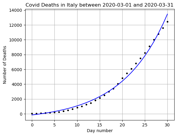
# Original Data
x = np.arange(0,len(DF_data)) # I represent the days as numbers
y = np.array(DF_data['Deaths'])

# Add 30 days
xfit = np.arange(0,len(DF_data)+30)
xfitexp = np.exp(xfit/10)
# Predict
yfit = betas[1] + betas[0]*xfitexp

plt.plot(x,y,'k.')
plt.plot(xfit,yfit,'b-')
plt.grid()
plt.title(f"Covid Deaths in {country} between {min(DF_data['DateTime'])} and {max(DF_data['DateTime'])}")
plt.xlabel('Day number')
plt.ylabel('Number of Deaths')
plt.show()

# Save the data for later
yfit_exp = yfit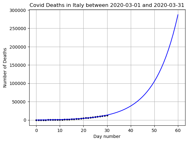
Does this seem like a good prediction? What are the positives and negatives?
Logarithmic Function
We could have used our knowledge of math to figure what the value of \(b\) is when \(c=0\)
\[ \ln(y) = \ln(ae^{bx}) = \ln(a) + \ln(e^{bx}) = \ln(a) + bx = A + bx \]
where \(A=\ln(a)\). This is the equation for a straight line and \(b\) is the slope!
Lets plot \(x\) vs \(\ln(y)\)
# Choose your x and y values

x = np.arange(0,len(DF_data)) # I represent the days as numbers
y = np.log(np.array(DF_data['Deaths']))

# Make your scatter plot
plt.plot(x,y,'.b')
plt.grid()
plt.title(f"COVID deaths in {country} between {min(DF_data['DateTime'])} and {max(DF_data['DateTime'])}")
plt.xlabel('Day Number')
plt.ylabel('Number of Deaths')
plt.show()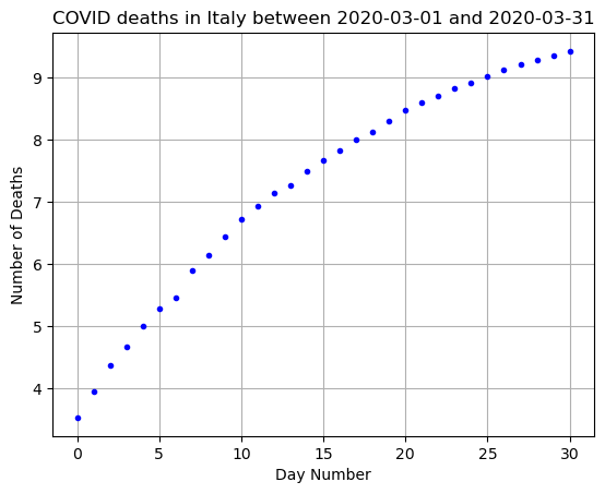
What do we observe?
Well, it looks a little more linear, especially for day days 0-15. It starts to curve back down for the later days.
The slope of this data could help us find our \(b\) value above! But this also gives us an indication that a pure exponential fit is maybe not the best choice!
# Choose your x and y values
x = np.arange(0,len(DF_data)) # I represent the days as numbers
y = np.array(DF_data['Deaths'])

betas = np.polyfit(x,np.log(y),1)
print(betas)
[0.18950162 4.42211045]So an estimate of \(b=1/10\) is within the range of what we found for \(b\) in our linear fit of x and log(y).
How do our predictions so far match with the real data?
# Start with initial data (MARCH and APRIL ONLY)

# Choose the dates
start_date = datetime.date(2020,3,1)
end_date = datetime.date(2020,4,30)

# Get the data for just those dates
mask = (DF['DateTime'] >= start_date) & (DF['DateTime'] <= end_date)
DF_data = DF[mask].copy()
x = np.arange(0,len(DF_data))
y = np.array(DF_data['Deaths'])
plt.plot(x,y,'k.')
plt.plot(x,yfit_poly,'b-',label='Polynomial Fit degree 4')
plt.plot(x,yfit_exp,'r-', label='Exponential Fit')
plt.grid()
plt.title(f"Covid Deaths in {country} between {min(DF_data['DateTime'])} and {max(DF_data['DateTime'])}")
plt.xlabel('Day number')
plt.ylabel('Number of Deaths')
plt.legend()
plt.show()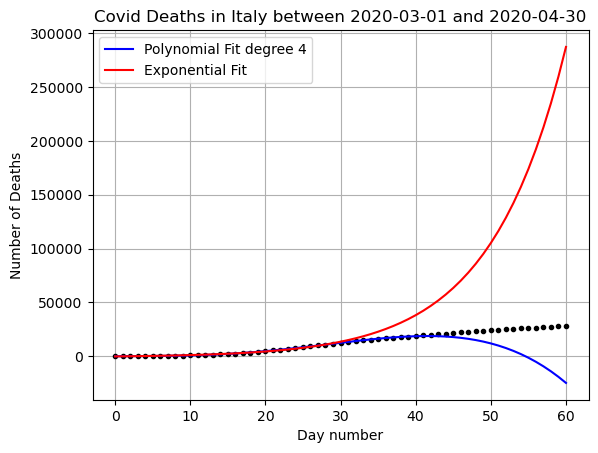
what went wrong here?
x = np.arange(0,len(DF_data))
y = np.array(DF_data['Deaths'])

plt.plot(x,y,'k.')
plt.grid()
plt.title(f"Covid Deaths in {country} between {min(DF_data['DateTime'])} and {max(DF_data['DateTime'])}")
plt.xlabel('Day number')
plt.ylabel('Number of Deaths')
plt.show()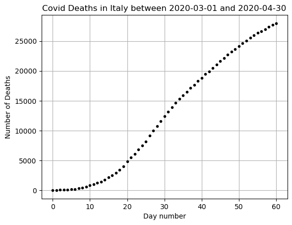
This data is only exponential at first. We can’t have exponential growth forever when there are a limited number of people! We need a better function to model this data if we want to predict past about the first 10-20 days.
Logistic function:
A logistic curve is a common S-shaped curve [sigmoid curve]. It can be useful for modeling many different phenomena, such as:
population growth tumor growth concentration of reactants and products in autocatalytic reactions
\[ y = f(x) = \frac{L}{1+e^{-k(x-x_0)}}\]
- \(L\) is the carrying capacity, the supremum of the values of the function;
- \(k\) is the logistic growth rate, the steepness of the curve; and
- \(x_{0}\) is the value of the function’s midpoint.
The Logistic Function is the solution to the Logistic Differential Equation:
\[ \frac{df}{dx} = k\left(1-\frac{f}{L}\right)f \]
Once we learn about derivatives we can talk about why this equation makes sense!
Let’s play around with this function a little bit and see what happens.
L=1
k=1
x0=0

x = np.arange(-5,5,.1)
y = L/(1+np.exp(-k*(x-x0)))

plt.plot(x,y,'r')
plt.grid()
plt.title('The logistic function')
plt.xlabel('x')
plt.ylabel('y')
plt.xlim(-5,5)
plt.ylim(0,5)
plt.show()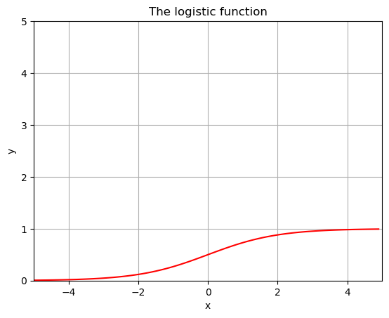
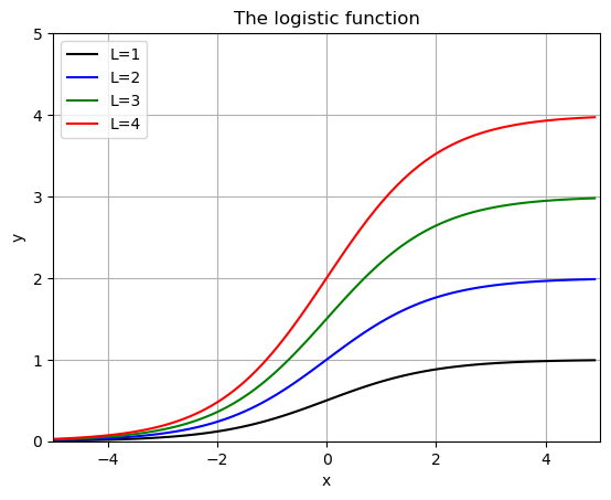
# Show some examples:
def f(x,L,k,x0):
return L/(1+np.exp(-k*(x-x0)))
x = np.arange(-5,5,.1)
Lvals = [1,2,3,4]
kvals = [1,2,3,4]
x0vals = [0,1,2,3]
colors = ['k','b','g','r']
for i,L in enumerate(Lvals):
plt.plot(x,f(x,L,1,0),colors[i],label=f'L={L}')
plt.grid()
plt.title('The logistic function')
plt.xlabel('x')
plt.ylabel('y')
plt.xlim(-5,5)
plt.ylim(0,5)
plt.legend()
plt.show()
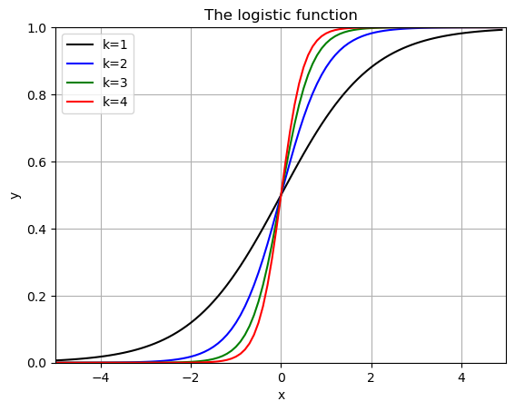
for i,k in enumerate(kvals):
plt.plot(x,f(x,1,k,0),colors[i],label=f'k={k}')
plt.grid()
plt.title('The logistic function')
plt.xlabel('x')
plt.ylabel('y')
plt.xlim(-5,5)
plt.ylim(0,1)
plt.legend()
plt.show()
for i,x0 in enumerate(x0vals):
plt.plot(x,f(x,1,1,x0),colors[i],label=f'x0={x0}')
plt.grid()
plt.title('The logistic function')
plt.xlabel('x')
plt.ylabel('y')
plt.xlim(-5,5)
plt.ylim(0,1)
plt.legend()
plt.show()
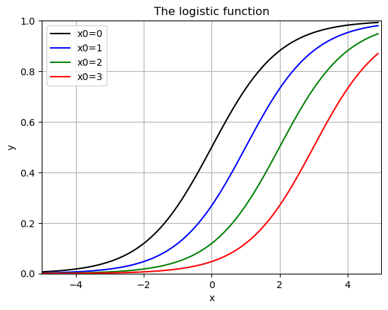
when \(L=1\), \(k=1\) and \(x_0 = 0\) this is called the “sigmoid fuction” - used in machine learning and classification (Logistic Regression).
How can we use this to fit our data?
Can we linearize this function?
We need a new bit of software since we can’t trick linear regression into solving this one!
Curve_fit()
The curve_fit() function assumes that we are looking for a function that takes the form:
\[y = \beta_0 + f(x,\vec{\beta}) \]
in this case our function \(f\) does not have to be linear in \(\beta\). We still minimize the square error between our given function and our data. BUT - we are not guaranteed a solution for any choice of \(f\).
curve_fit() takes three pieces of information
- a function form for our \(f\)
- x data
- y data
from scipy.optimize import curve_fit# Start with initial data (MARCH and APRIL ONLY)
# Choose the dates
start_date = datetime.date(2020,3,1)
end_date = datetime.date(2020,4,30)
# Get the data for just those dates
mask = (DF['DateTime'] >= start_date) & (DF['DateTime'] <= end_date)
DF_data = DF[mask].copy()# Get our data
x = np.arange(0,len(DF_data))
y = np.array(DF_data['Deaths'])
# Define the function
def f(x,L,k,x0):
return L/(1+np.exp(-k*(x-x0)))
coeffs, covar = curve_fit(f, x, y)# Plot the results
x = np.arange(0,len(DF_data))
yfit = f(x,coeffs[0],coeffs[1],coeffs[2])
plt.plot(x,yfit)
plt.plot(x,y,'k.')
plt.grid()
plt.title(f"Covid Deaths in {country} between {min(DF_data['DateTime'])} and {max(DF_data['DateTime'])}")
plt.xlabel('Day number')
plt.ylabel('Number of Deaths')
plt.show()
print(f'R squared: {r2_score(y,yfit)}')
print(f'MSE: {mean_squared_error(y,yfit)}')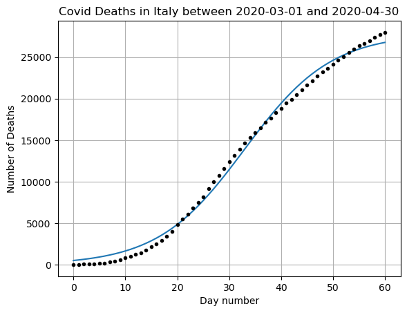
R squared: 0.9951845113335896
MSE: 461578.7906243469
Does this seem like a good prediction? What are the positives and negatives?
Covariance matrix gives us information about our parameters
covararray([[ 1.29603121e+05, -9.75495123e-01, 1.09683301e+02],
[-9.75495123e-01, 1.26666959e-05, -8.29256418e-04],
[ 1.09683301e+02, -8.29256418e-04, 1.24405955e-01]])The diagonals of this matrix tell me how much variance in in each of the parameter estimations. Here we see that
- There is 1.29603121e+05 varriance in \(L\) meaning that the choice of \(L\) could change a lot if our underlying data changed a little bit. We would say our model is sensitive to the choice of \(L\) and we would worry that our model is overfitting our specific data in this parameter.
- There is 1.26666959e-05 variance in \(k\). This value is quite small and this means we are fairly confident in our estimation of \(k\)
- There is 1.24405955e-01 variance in \(x_0\). This is somewhat small, so while our data is somewhat sensitive to the center, it is not the most sensitive part of the data.
The off diagonal elements give us a glimpse of how uncertainty in one parameter might cause uncertainty in another. For example the first column represents how uncertainty in \(L\) effects the other values in order \(L\), \(k\), and \(x_0\)
#Lets expand our time data again and see how we did.

# Choose the dates
start_date = datetime.date(2020,3,1)
end_date = datetime.date(2020,6,30)

# Get the data for just those dates
mask = (DF['DateTime'] >= start_date) & (DF['DateTime'] <= end_date)
DF_data = DF[mask].copy()
x = np.arange(0,len(DF_data))
y = np.array(DF_data['Deaths'])
yfit = f(x,coeffs[0],coeffs[1],coeffs[2])
plt.plot(x,y,'k.')
plt.plot(x,yfit,'b-')
plt.grid()
plt.title(f"Covid Deaths in {country} between {min(DF_data['DateTime'])} and {max(DF_data['DateTime'])}")
plt.xlabel('Day number')
plt.ylabel('Number of Deaths')
plt.show()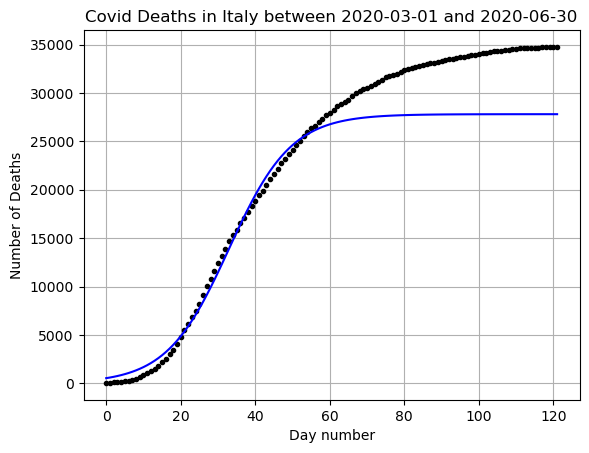
Here you can see that if we were using our function to predict into the future we have a good basic shape, but we did not have very high accuracy when considering the \(L\) value or the carrying capacity. This is just one of the many reasons that disease modeling is extremely complicated!
Look at all the data!
Imagine how complicated it would be to fit the full range of data with just one function!
This is why for more complicated data we need more advanced methods. May of those methods require calculus, probability, or linear algebra to understand.
x = np.arange(0,len(DF))
y = np.array(DF['Deaths'])

plt.plot(x,y,'.k')
plt.grid()
plt.title(f"Covid Deaths in {country} between {min(DF_data['DateTime'])} and {max(DF_data['DateTime'])}")
plt.xlabel('Day number')
plt.ylabel('Number of Deaths')
plt.show()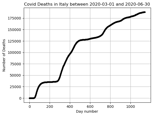
YOU TRY
Redo this analysis for a different country. You should:
- Choose a country and plot the data for just the months of March and April
- Try a polynomial fit, calculate MSE and R^2, graph the results. Talk about what all these things tell you.
- Try an exponential fit, calculate MSE and R^2, graph the results. Talk about what all these things tell you.
- Plot the log(y) vs x graph and talk about what it tells you.
- Use curve_fit to do a logistic function fit of the data. Calculate MSE and R^2, graph the results, and look at the covariance matrix. Talk about what all these things tell you.
(extra) CHALLENGE: For each fit you tried above. Plot a prediction for the next month (March, April and May). Add all of your models (poly, exp, and logistic) to the graph one at a time. How do they do in predicting the next month.