# !conda install -y seaborn
# !conda install -y bokehIntermediate Data Science
Visualization
Intermediate Data Science
Important Information
- Email: joanna_bieri@redlands.edu
- Office Hours take place in Duke 209 – Office Hours Schedule
- Class Website
- Syllabus
Plotting and Visualization
In Data101 we learned about the plotly package. Here are some resources to help remind you about visualizing data in plotly:
Plotly is a great software package that produces interactive plots with lots of customization. But it is not the only way to create outstanding graphics.
We will see three new plotting packages today:
- Matplotlib - creates plots and figures suitable for publication. It can export graphics in a variety of vector and raster formats (.pdf, .svg, .jpg,.png, .bmp, .gif, …). It often forms the basis for more advanced plotting packages and is well supported in Pandas.
- Seaborn - is a high-level statistical graphics library, built on matplotlib, but with functions that automate the creation of many common visualization types.
- Bokeh - is a library that enables the creation of highly customizable and interactive plots, dashboards, and web applications for modern web browsers. Similar to plotly but more specific to Python and more focused on interactive web applications.
I usually start with either matplotlib or plotly and then switch to other methods if needed as I start creating images for production or publication.
Install the packages as needed
# Some basic package imports
import os
import numpy as np
import pandas as pd

# Visualization packages
import matplotlib.pyplot as plt
import plotly.express as px
from plotly.subplots import make_subplots
import plotly.io as pio
pio.renderers.defaule = 'colab'
import seaborn as sns
Matplotlib
It is standared to import matplotlib.pyplot as plt. Try looking at the plt. packages to see what all is available!
#plt.Here is a minimal example:
# First create some data
x = np.arange(0,10,.1) # Choose your x-values
y = np.sqrt(x) # Get the y values - use a function

# Create the plot
plt.plot(x,y)
plt.show()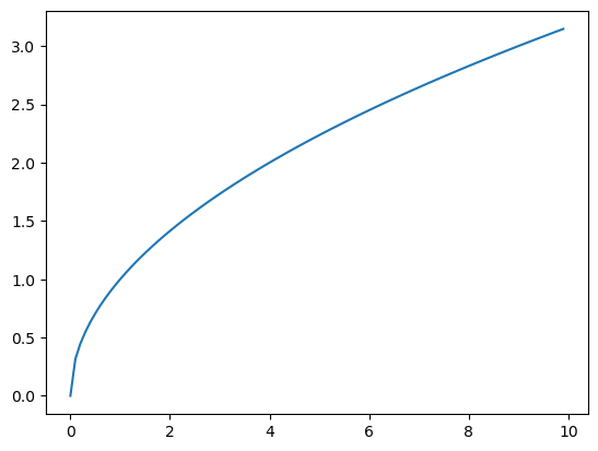
An example with multiple lines
# First create some data
x = np.arange(0,2,.01) # Choose your x-values
y1 = np.sqrt(x) # Get the y values - use a function
y2 = x**2
y3 = x

# Create the plot
# Notice the lines are added to the same figure
# The colors and line style are automatic
plt.plot(x,y1)
plt.plot(x,y2)
plt.plot(x,y3)
plt.show()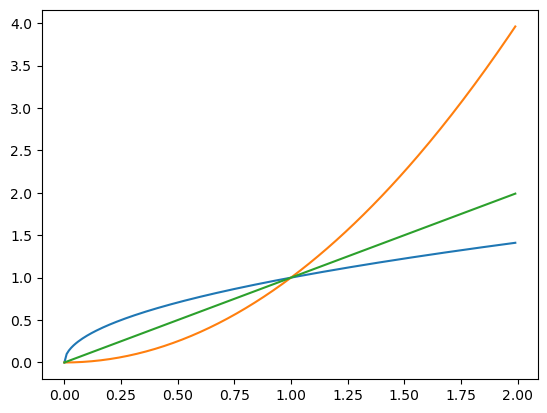
Subplots - multiple plots in one figure
# First create some data
x = np.arange(0,2,.01) # Choose your x-values
y1 = np.sqrt(x) # Get the y values - use a function
y2 = x**2
y3 = x

# Now create the figure object
fig = plt.figure()

# Now add some subplots
ax1 = fig.add_subplot(2,2,1) # This says 2x2 grid in location1
ax2 = fig.add_subplot(2,2,2)
ax3 = fig.add_subplot(2,2,3) # The subfigures go left to right top to bottom

# Now put the data into the subplots
ax1.plot(x,y1)
ax2.plot(x,y2)
ax3.plot(x,y3)

plt.show()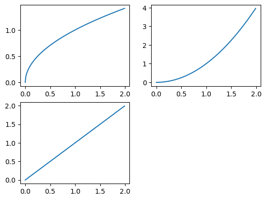
Other plot types
# Let's create some more interesting data
x = np.random.standard_normal(100) # generate random data
y = x.cumsum() # compute the running total of elements x

# Now create the figure object
fig = plt.figure()
# Now add some subplots
ax1 = fig.add_subplot(2,2,1) # This says 2x2 grid in location1
ax2 = fig.add_subplot(2,2,2)
ax3 = fig.add_subplot(2,2,3) # The subfigures go left to right top to bottom

# Now put the data into the subplots
# For some functions you don't need x and y
ax1.plot(y)
# Some functions only accept one input value to bin
ax2.hist(y)
# Some function require both x and y.
ax3.scatter(x,y)

plt.show()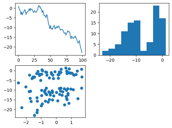
Adding some line styles
# Let's create some more interesting data
x = np.random.standard_normal(100) # generate random data
y = x.cumsum() # compute the running total of elements x
fig = plt.figure()
ax1 = fig.add_subplot(2,2,1) # This says 2x2 grid in location1
ax2 = fig.add_subplot(2,2,2)
ax3 = fig.add_subplot(2,2,3) # The subfigures go left to right top to bottom

# Update the color and add dasked line
ax1.plot(y,color='black', linestyle='dashed')
# choose number of bins and make less opaque
ax2.hist(y,color='black',bins=20,alpha=0.4)
# change color and marker, make less opaque
ax3.scatter(x,y,color='red',marker='*',alpha=.5)

plt.show()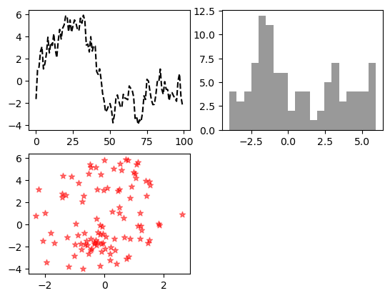
More advanced subplots
In this example we will see how to create subplots using the plt.subplots command, instead of specifying the axes independently. This is really useful when creating plots in a for loop.
# This command automatically creates all the axes
# We will do a 2x2 grid.
# Then add to each plot by calling axes[1,1], axes[1,2], ...
fig, axes = plt.subplots(2, 2)
for i in range(2):
    for j in range(2):
        axes[i, j].hist(np.random.standard_normal(500), bins=50,
                        color="black", alpha=0.5)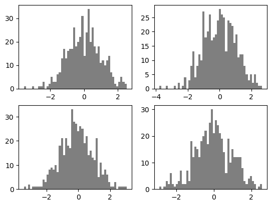
# A small change to the code above reduces the white space
# and has all the plots use the same x and y-axis
fig, axes = plt.subplots(2, 2, sharex=True, sharey=True)
for i in range(2):
    for j in range(2):
        axes[i, j].hist(np.random.standard_normal(500), bins=50,
                        color="purple", alpha=0.5)

# Remove white space
fig.subplots_adjust(wspace=0, hspace=0)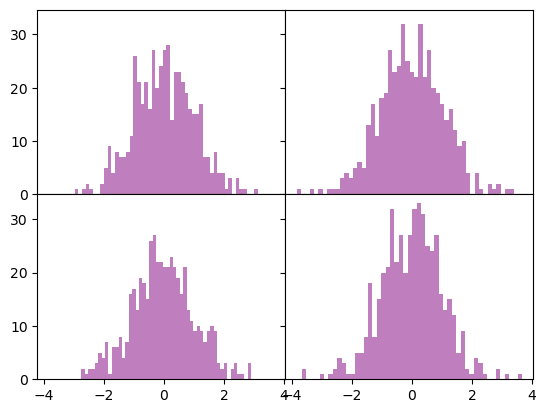
Matplotlib - linestyles, markers, and colors
Here is a quick overview of the options available in matplot lib:
🟢 Common Colors (Short Codes)
| Code | Color |
|---|---|
'b' |
blue |
'g' |
green |
'r' |
red |
'c' |
cyan |
'm' |
magenta |
'y' |
yellow |
'k' |
black |
'w' |
white |
🌈 Full Named Colors
Matplotlib also supports full names like: - 'blue', 'green', 'red', 'orange', 'purple', 'brown', 'pink', 'gray', 'olive', 'navy', etc.
You can also use hex codes:
color = '#1f77b4' # Matplotlib's default blue📈 Line Styles
| Code | Description |
|---|---|
'-' |
Solid line |
'--' |
Dashed line |
'-.' |
Dash-dot line |
':' |
Dotted line |
'' or ' ' |
No line (useful for markers only) |
🔵 Marker Styles
| Code | Marker |
|---|---|
'o' |
Circle |
'^' |
Triangle up |
'v' |
Triangle down |
's' |
Square |
'D' |
Diamond |
'x' |
X |
'+' |
Plus |
'*' |
Star |
'.' |
Point |
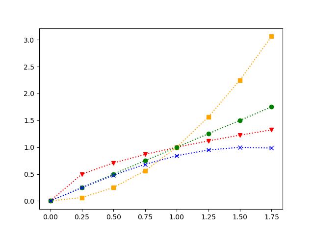
An example with colors!
# First create some data
x = np.arange(0,2,.25)
y1 = np.sqrt(x)
y2 = x**2
y3 = x
y4 = np.sin(x)


fig, axes = plt.subplots(2,2)
# Now put the data into the subplots
# Each one demonstrates a different way to add colors, lines, and markers
axes[0,0].plot(x,y1,color='olive',linestyle='--', marker='o')
axes[0,1].plot(x,y2,'m-.*')
axes[1,0].plot(x,y3,color='#00CED1',marker='D')
axes[1,1].plot(x,y4,':')

plt.show()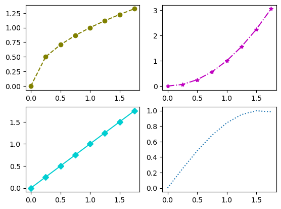
You Try
See if you can recreate the plot below. The functions used are the same as above.
x = np.arange(0,2,.25)
y1 = np.sqrt(x)
y2 = x**2
y3 = x
y4 = np.sin(x)

# Your code here
Matplotlib - Ticks, Labels, and Legends
As you can see in the plots above, it becomes important to be able to add labels and legends to your plots. Matplotlib allows you to create plots with legends and other more fancy features!
- You can use the
label=command to label each item. - You can use
.grid()to add a background grid to the plots - The command
.legend()adds the legend to each plot - You can set the ranges on the x and y-axes using
.xlim()and.ylim() - The commands
xticks()andyticks()updates the markers on the x and y-axes
You can also add titles and labels to the axes!
x = np.arange(0,2,.25)
y1 = np.sqrt(x)
y2 = x**2
y3 = x
y4 = np.sin(x)


fig, axes = plt.subplots(2,2)
# The only change here is to add a label to each line
axes[0,0].plot(x,y1,color='olive',linestyle='--', marker='o',label='Square Root')
axes[0,1].plot(x,y2,'m-.*',label='Squared')
axes[1,0].plot(x,y3,color='#00CED1',marker='D',label='Straight Line')
axes[1,1].plot(x,y4,':',label='Sine Function')

# Then add the legend and grid in a for loop
# Here axes.flat is a 1D iterator over all the subplot Axes objects
for ax in axes.flat:
    ax.grid()
    ax.legend()


plt.show()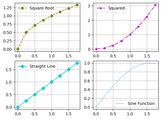
x = np.arange(0,2,.25)
y1 = np.sqrt(x)

plt.plot(x,y1,'m-o')
# Change the limits
plt.xlim([0,2])
plt.ylim([0,2])
# Add a grid
plt.grid()

# Change what is on the axes
xtick_positions = [0, 0.5, 1, 1.5, 2]
xtick_labels = ['zero', 'half', 'one', 'one & half', 'two']
plt.xticks(xtick_positions, xtick_labels,rotation=30,fontsize=10)

ytick_positions = [0,0.75,1.50]
ytick_labels=['min','middle','max']
plt.yticks(ytick_positions,ytick_labels,fontsize=8)

# Add a title and labels
plt.title('My example of tick locations and labels')
plt.xlabel('Here is the x-axis')
plt.ylabel('Here is the y-axis')


plt.show()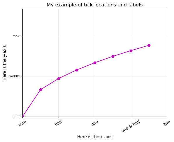
Matplotlib - Adding Annotations
Sometimes you want to add text to your plot that helps you point out important aspects of the data. This can be done by adding annotations. This example will walk us through a few new ideas:
- Using
datetimeobjects in python. These represent a specific point in time — including the year, month, day, hour, minute, second, microsecond, and optionally a time zone. - Calling
.plotdirectly on a pandas series object - Adding annotations from a list
from datetime import datetime

# Read in the data using pandas
data = pd.read_csv("data/spx.csv", index_col=0, parse_dates=True)
# Get just the SPX column - this is a series object
spx = data["SPX"]

# Call .plot on this object and send in optional commands
spx.plot(color="red",linewidth=.5)

# Now we will hard code some events that take place over time
# datetime tells python that this is a data and should be ordered that way
# This is a list of tuples
crisis_data = [
    (datetime(2007, 10, 11), "Peak of bull market"),
    (datetime(2008, 3, 12), "Bear Stearns Fails"),
    (datetime(2008, 9, 15), "Lehman Bankruptcy")
]

# Now cycle through the events
for date, label in crisis_data:
    # Add an annotation for each
    # label is the words you want to add
    # xy= is the (x,y) location of pointer end
    # xytext= is the (x,y) location of the words
    # arrowprops= lets you set arrow properties
    plt.annotate(label, xy=(date, spx.asof(date) + 75),
                xytext=(date, spx.asof(date) + 225),
                arrowprops=dict(facecolor="black", headwidth=4, width=1,
                                headlength=4),
                horizontalalignment="left", verticalalignment="top")

# Set the x and y limits to zoom in on 2007-2010
plt.xlim(["1/1/2007", "1/1/2011"])
plt.ylim([600, 1800])

plt.title("Important dates in the 2008–2009 financial crisis")
plt.grid()

plt.show()
You Try
Now using what you know about annotations and labels. See if you can recreate the plot with the data given below.
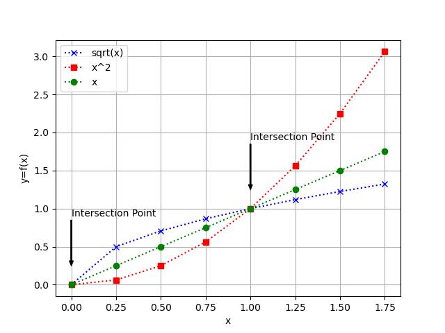
x = np.arange(0, 2, 0.25)
y1 = np.sqrt(x)
y2 = x**2
y3 = x

# Your code here
Matplotlib - bar plot
Here is an example of a bar plot. What I want you to learn here is that the basic syntax is always the same! Once you know the structure of matplotlib you can explore all sorts of plots.
# Example data
categories = ["Math", "Science", "History", "English", "Art"]
# Create x positions for bars
# This creates x = [0,1,2,3,4] as a place holder for the x-labels
x = np.arange(len(categories))
yvalues = [85, 92, 78, 88, 95]

plt.bar(
    x,
    yvalues,
    color="skyblue",          # change bar color
    edgecolor="black",        # add edge color
    linewidth=1.5,            # thickness of edges
    hatch="/",                # pattern fill
    alpha=0.8,                # transparency (0=transparent, 1=opaque)
    width=0.6,                # width of bars
    align="center"            # alignment: 'center' (default) or 'edge'
)

# Add labels, title, and ticks
plt.title("Student Test Scores by Subject", fontsize=16, fontweight="bold")
plt.xlabel("Subjects", fontsize=12)
plt.ylabel("Scores", fontsize=12)

# Change the ticks and categories on the axis
plt.xticks(x, categories, rotation=30, fontsize=10)
# Have y-ticks be every 10
plt.yticks(np.arange(0, 101, 10))

# Add grid lines to only the y-axis
plt.grid(axis="y", linestyle="--", alpha=0.7)


for i, v in enumerate(yvalues):
    plt.annotate(str(yvalues[i]), xy=(x[i], v + 4),
                horizontalalignment='center', verticalalignment="top")

# Show plot
plt.show()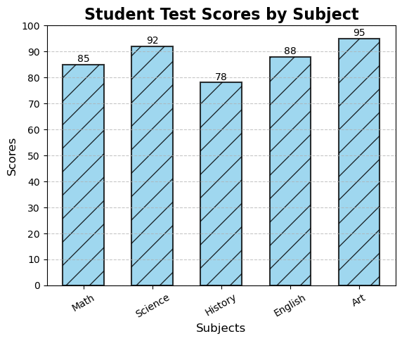
Matplotlib - more crazy examples
Just for fun!
plt.pie(
    yvalues, labels=categories,
    autopct="%1.1f%%", startangle=90,
    colors=plt.cm.Paired.colors,
    explode=[0, 0.1, 0, 0, 0]  # emphasize Science
)
plt.title("Student Scores as Percentage of Total", fontsize=14, fontweight="bold")
plt.show()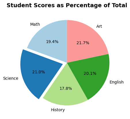
from math import pi

# For this type of plot you need to deal with angles
# We do this in radians
N = len(categories)
# Make the values loop back around so the first and last are the same
values_loop = yvalues + [yvalues[0]]
# Create the right number of angles to match the number of values
# Then add zero on the end to loop back around
angles = [n / float(N) * 2 * pi for n in range(N)] + [0]

plt.polar(angles, values_loop, "o-", linewidth=2, label="Scores", color="darkorange")
# Fill inside the lines
plt.fill(angles, values_loop, alpha=0.25, color="orange")
# Update the ticks
plt.xticks(angles[:-1], categories)
plt.yticks(range(0, 101, 20))
plt.title("Student Scores by Subject (Radar Plot)", fontsize=14, fontweight="bold")
# Move the legend
plt.legend(loc="upper right")
plt.show()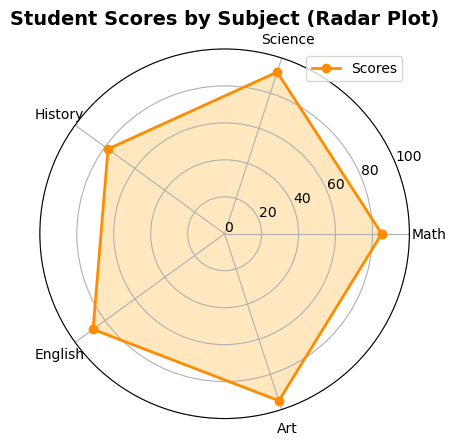
Matplotlib - Saving and Configuration
If you want to save a figure that you have created you need to add
plt.savefig('figurename.jpg')
BEFORE you do plt.show().
You can customize the size of your plot
plt.rc('figure', figsize=(10,10))
And to go back to default
plt.rcdefaults()
There are LOTS of other options that you can take advantage of!
Pandas Plotting
There are default plotting options that leverage matplotlib as part of the pandas package. You can see our book pp.298-310 for examples. I tend to use matplotlib directly or plotly more than pandas, but some peple find it very convenient.
Basic plot methods
df.plot()– general plotting interface (line by default)df.plot.line()– line plotsdf.plot.bar()– vertical bar plotsdf.plot.barh()– horizontal bar plotsdf.plot.hist()– histogramsdf.plot.box()– box-and-whisker plotsdf.plot.area()– stacked area plotsdf.plot.scatter(x=..., y=...)– scatter plotsdf.plot.hexbin(x=..., y=...)– hexagonal binning plotdf.plot.density()/df.plot.kde()– kernel density estimate plotsdf.plot.pie()– pie charts (usually with a Series)
Seaborn
Here I will give a VERY quick overview of some ways that you might use seaborn. It has some really handy, and beautiful visualization packages that are more specific to statistical analysis.
Start by looking at some data
# Here is some example macroeconomic data
macro = pd.read_csv("data/macrodata.csv")
macro| year | quarter | realgdp | realcons | realinv | realgovt | realdpi | cpi | m1 | tbilrate | unemp | pop | infl | realint | |
|---|---|---|---|---|---|---|---|---|---|---|---|---|---|---|
| 0 | 1959 | 1 | 2710.349 | 1707.4 | 286.898 | 470.045 | 1886.9 | 28.980 | 139.7 | 2.82 | 5.8 | 177.146 | 0.00 | 0.00 |
| 1 | 1959 | 2 | 2778.801 | 1733.7 | 310.859 | 481.301 | 1919.7 | 29.150 | 141.7 | 3.08 | 5.1 | 177.830 | 2.34 | 0.74 |
| 2 | 1959 | 3 | 2775.488 | 1751.8 | 289.226 | 491.260 | 1916.4 | 29.350 | 140.5 | 3.82 | 5.3 | 178.657 | 2.74 | 1.09 |
| 3 | 1959 | 4 | 2785.204 | 1753.7 | 299.356 | 484.052 | 1931.3 | 29.370 | 140.0 | 4.33 | 5.6 | 179.386 | 0.27 | 4.06 |
| 4 | 1960 | 1 | 2847.699 | 1770.5 | 331.722 | 462.199 | 1955.5 | 29.540 | 139.6 | 3.50 | 5.2 | 180.007 | 2.31 | 1.19 |
| ... | ... | ... | ... | ... | ... | ... | ... | ... | ... | ... | ... | ... | ... | ... |
| 198 | 2008 | 3 | 13324.600 | 9267.7 | 1990.693 | 991.551 | 9838.3 | 216.889 | 1474.7 | 1.17 | 6.0 | 305.270 | -3.16 | 4.33 |
| 199 | 2008 | 4 | 13141.920 | 9195.3 | 1857.661 | 1007.273 | 9920.4 | 212.174 | 1576.5 | 0.12 | 6.9 | 305.952 | -8.79 | 8.91 |
| 200 | 2009 | 1 | 12925.410 | 9209.2 | 1558.494 | 996.287 | 9926.4 | 212.671 | 1592.8 | 0.22 | 8.1 | 306.547 | 0.94 | -0.71 |
| 201 | 2009 | 2 | 12901.504 | 9189.0 | 1456.678 | 1023.528 | 10077.5 | 214.469 | 1653.6 | 0.18 | 9.2 | 307.226 | 3.37 | -3.19 |
| 202 | 2009 | 3 | 12990.341 | 9256.0 | 1486.398 | 1044.088 | 10040.6 | 216.385 | 1673.9 | 0.12 | 9.6 | 308.013 | 3.56 | -3.44 |
203 rows × 14 columns
# Lets choose a subset of the rows to focus on
data = macro[["cpi", "m1", "tbilrate", "unemp"]]
data| cpi | m1 | tbilrate | unemp | |
|---|---|---|---|---|
| 0 | 28.980 | 139.7 | 2.82 | 5.8 |
| 1 | 29.150 | 141.7 | 3.08 | 5.1 |
| 2 | 29.350 | 140.5 | 3.82 | 5.3 |
| 3 | 29.370 | 140.0 | 4.33 | 5.6 |
| 4 | 29.540 | 139.6 | 3.50 | 5.2 |
| ... | ... | ... | ... | ... |
| 198 | 216.889 | 1474.7 | 1.17 | 6.0 |
| 199 | 212.174 | 1576.5 | 0.12 | 6.9 |
| 200 | 212.671 | 1592.8 | 0.22 | 8.1 |
| 201 | 214.469 | 1653.6 | 0.18 | 9.2 |
| 202 | 216.385 | 1673.9 | 0.12 | 9.6 |
203 rows × 4 columns
cpi - Consumer Price Index - A measure of the average change over time in the prices paid by consumers for goods and services. Used to track inflation.
m1 - Money Supply (M1) - A measure of the money stock that includes currency in circulation, demand deposits, and other liquid assets. Indicates how much liquid money is in the economy.
tbilrate - Treasury Bill Rate - The short-term interest rate on U.S. government Treasury bills (often 3-month T-bills). Used as a benchmark for short-term interest rates and monetary policy stance.
unemp - Unemployment Rate - The percentage of the labor force that is jobless and actively looking for work. Indicator of labor market health.
# Often with data we want to look at the log of the data
'''
Taking the log can:
    - make growth rates easier to interpret
    - stabilize variance
    - linearizes relationships
    - make distributions closer to normal

'''
trans_data = np.log(data).diff().dropna()
trans_data.tail()| cpi | m1 | tbilrate | unemp | |
|---|---|---|---|---|
| 198 | -0.007904 | 0.045361 | -0.396881 | 0.105361 |
| 199 | -0.021979 | 0.066753 | -2.277267 | 0.139762 |
| 200 | 0.002340 | 0.010286 | 0.606136 | 0.160343 |
| 201 | 0.008419 | 0.037461 | -0.200671 | 0.127339 |
| 202 | 0.008894 | 0.012202 | -0.405465 | 0.042560 |
Seaborn - regplot()
Now we can look at a scatter plot of the money supply vs the unemployment rate and add a linear regression line with 95% confidence interval around the fitted regression
ax = sns.regplot(x="m1", y="unemp", data=trans_data)
ax.set_title("Changes in log(m1) versus log(unemp)")

# You can add standard matplotlib style commands
ax.grid()
ax.set_xlabel('Money Supply')
ax.set_ylabel('Unemployment')
Text(0, 0.5, 'Unemployment')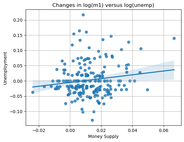
Seaborn - pairplot
A seaborn pairplot gives a quick multivariate overview of the variables in your data set. You can see how each numerical variable varies against every other one and see the single variable distribution of individual variables (histograms or KDEs). This lets you very quickly look for correlations and interesting aspects of your data (like outliers).
sns.pairplot(trans_data, diag_kind="kde", plot_kws={"alpha": 0.2})
plt.show()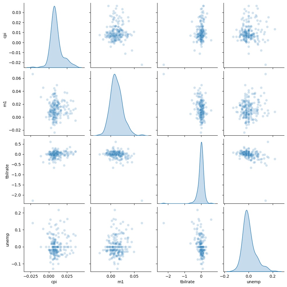
Bokeh plots
The Bokeh packages allows you to create more interactive plots. While this is not necessary for exploratory data analysis, it can be a great way to allow your audience to interact with your data. I am not going to do a full tutorial here, but just show an example so you can see what Bokeh has to offer.
There are lots of tutorials online if you want to learn more!
On the side of the figure you can choose the tools that are available. here is a list of the possible tools.
| Tool Name | Description |
|---|---|
pan |
Pan the plot by dragging. |
wheel_zoom |
Zoom in/out using the mouse wheel. |
box_zoom |
Zoom into a rectangular region. |
reset |
Reset the plot to its original view. |
save |
Save the plot as a PNG file. |
hover |
Show tooltips when hovering over glyphs. |
crosshair |
Show crosshair lines that follow the cursor. |
tap |
Select a glyph by clicking on it. |
box_select |
Select glyphs in a rectangular region. |
lasso_select |
Select glyphs with a freehand lasso. |
poly_select |
Select glyphs using a polygon (more general selection). |
help |
Show a small help icon with tooltips for available tools. |
| Marker Name | Shape Description |
|---|---|
circle |
Standard circle |
square |
Square |
triangle |
Upward-pointing triangle |
inverted_triangle |
Downward-pointing triangle |
diamond |
Diamond shape |
cross |
X shape |
x |
Another X variant |
asterisk |
Star-like asterisk |
circle_cross |
Circle with a cross inside |
circle_x |
Circle with an X inside |
square_cross |
Square with a cross inside |
square_x |
Square with an X inside |
diamond_cross |
Diamond with a cross inside |
diamond_x |
Diamond with an X inside |
triangle_dot |
Triangle with a dot |
inverted_triangle_dot |
Inverted triangle with a dot |
There are TONS of named colors!
| Color Name | Color Name | Color Name | Color Name |
|---|---|---|---|
| aliceblue | antiquewhite | aqua | aquamarine |
| azure | beige | bisque | black |
| blanchedalmond | blue | blueviolet | brown |
| burlywood | cadetblue | chartreuse | chocolate |
| coral | cornflowerblue | cornsilk | crimson |
| cyan | darkblue | darkcyan | darkgoldenrod |
| darkgray | darkgreen | darkgrey | darkkhaki |
| darkmagenta | darkolivegreen | darkorange | darkorchid |
| darkred | darksalmon | darkseagreen | darkslateblue |
| darkslategray | darkslategrey | darkturquoise | darkviolet |
| deeppink | deepskyblue | dimgray | dimgrey |
| dodgerblue | firebrick | floralwhite | forestgreen |
| fuchsia | gainsboro | ghostwhite | gold |
| goldenrod | gray | green | greenyellow |
| grey | honeydew | hotpink | indianred |
| indigo | ivory | khaki | lavender |
| lavenderblush | lawngreen | lemonchiffon | lightblue |
| lightcoral | lightcyan | lightgoldenrodyellow | lightgray |
| lightgreen | lightgrey | lightpink | lightsalmon |
| lightseagreen | lightskyblue | lightslategray | lightslategrey |
| lightsteelblue | lightyellow | lime | limegreen |
| linen | magenta | maroon | mediumaquamarine |
| mediumblue | mediumorchid | mediumpurple | mediumseagreen |
| mediumslateblue | mediumspringgreen | mediumturquoise | mediumvioletred |
| midnightblue | mintcream | mistyrose | moccasin |
| navajowhite | navy | oldlace | olive |
| olivedrab | orange | orangered | orchid |
| palegoldenrod | palegreen | paleturquoise | palevioletred |
| papayawhip | peachpuff | peru | pink |
| plum | powderblue | purple | red |
| rosybrown | royalblue | saddlebrown | salmon |
| sandybrown | seagreen | seashell | sienna |
| silver | skyblue | slateblue | slategray |
| slategrey | snow | springgreen | steelblue |
| tan | teal | thistle | tomato |
| turquoise | violet | wheat | white |
| whitesmoke | yellow | yellowgreen |
from bokeh.plotting import figure, show
from bokeh.io import output_notebook
from bokeh.models import HoverTool

# This tells bokeh to output it's code to the jupyter notebook.
# the default is to create an html file and show the plot in a new browser window.
output_notebook()

# Create some data
x = np.arange(0,10,0.2)
y = np.sin(x)

# Create figure - this is calling the bokeh.plotting figure function
p = figure(
    title="Interactive Sine Wave",
    x_axis_label="X",
    y_axis_label="sin(X)",
    tools="pan,wheel_zoom,box_zoom,reset,save"
)

# Create a scatter plot of the data
# Notice that the "feel" is very matplotlib with some slight variations.
p.scatter(
    x, y,
    size=8,
    marker="circle",   # could be "square", "triangle", etc.
    color="navy",
    alpha=0.6,
    legend_label="sin(x)"
)

# Add line to connect the scatter plot points
p.line(x, y, line_width=2, color="orange", alpha=0.7)

# Add a mouse hover tool and tell it what data to show
hover = HoverTool(tooltips=[("x", "@x"), ("y", "@y")])
p.add_tools(hover)

# Show the plot you have created
show(p)